Harmonizing Color for Comic Covers
How to pick a palette, the importance of color profiles, and how to bring overall balance to your piece
Keyla Valerio
In the past, I’ve struggled with keeping a consistent palette when it comes to color. Even if I started a piece with a limited color palette, I would still end up with a bunch of different colors that I never planned for.
Instead of fighting myself about it, I tried finding a way to make it the highlight of my work.
I start every piece with a ton of photo references for my figures, environments, lighting, and color inspiration. My inspo for color can range anywhere from paintings I love, landscape photos, fabrics, things found in nature, makeup, etc. However, my favorite resource is https://color.adobe.com/
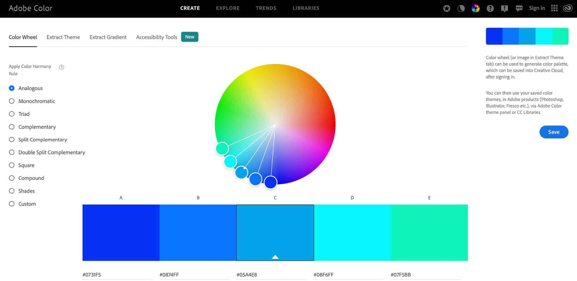
The opening page looks something like this…
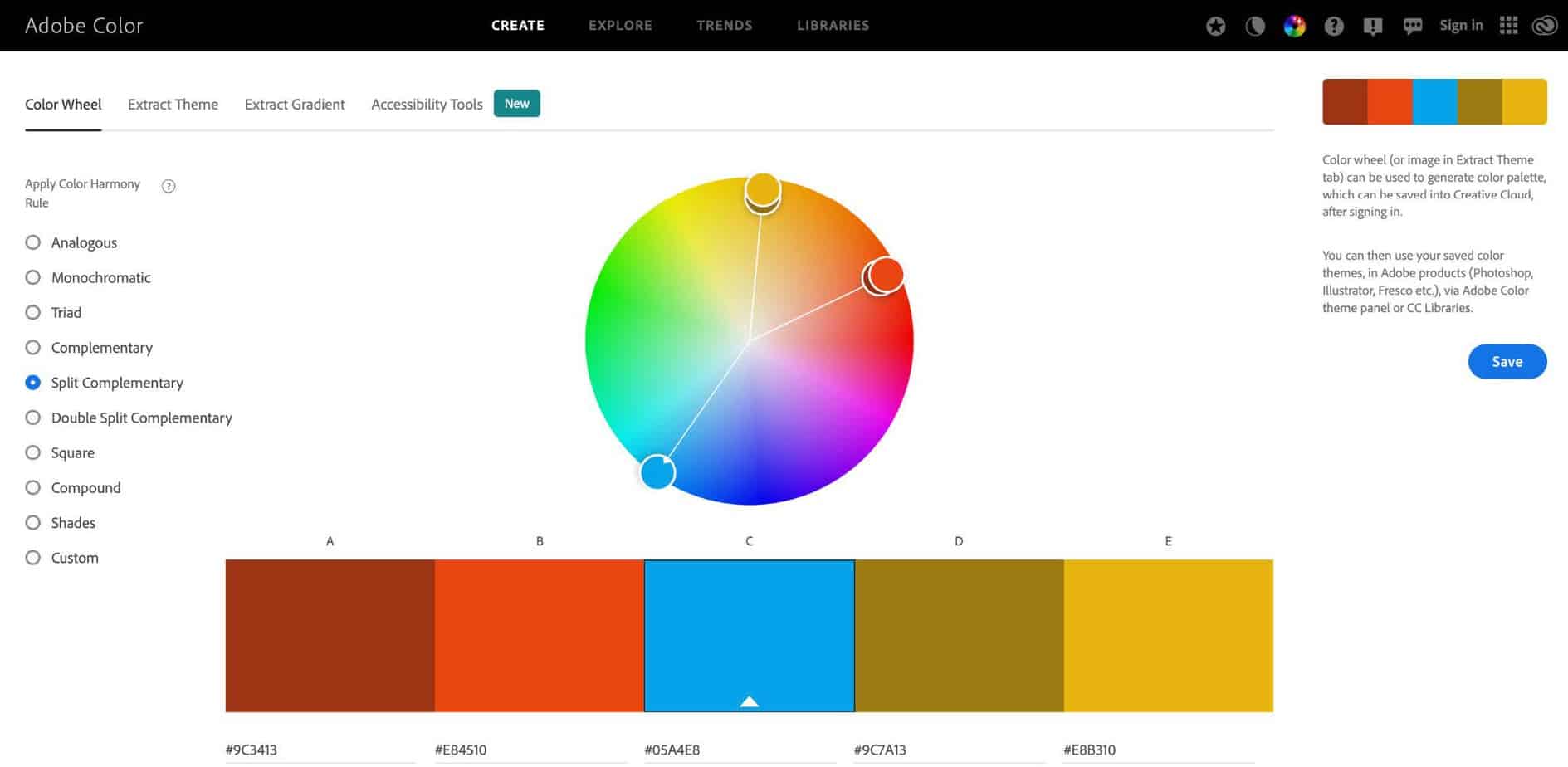
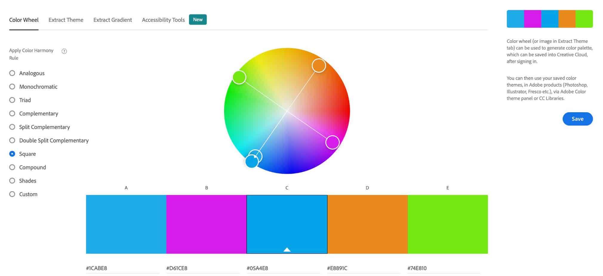
The middle color is the main color you want to work with and the left sidebar helps you figure out a color scheme. You can quickly sort through the options and refine your colors for what you need.
This is a simple tool if you need a quick palette. To the left of the color strip you’ll see an option for different color modes (RGB, CMYK, HSB, and LAB) and each swatch comes with its respective HEX code. This is all incredibly helpful whether you’re picking colors for web or print.
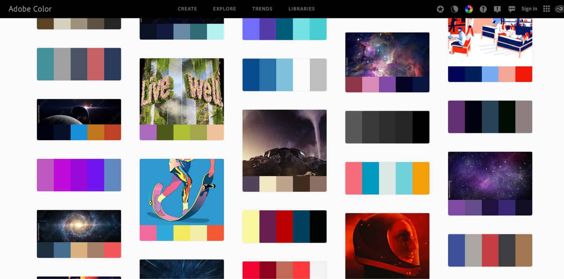
My next shameless plug for Adobe is that this website comes with a “Trends” tab if you’re looking to do more editorial/commercial work, or an “Explore” tab if you have no idea what you want to do (this is where I usually start because I’m usually clueless about what I want my colors to be).
How this helped me start my first Mighty Morphin Power Rangers cover for Boom!Studios…
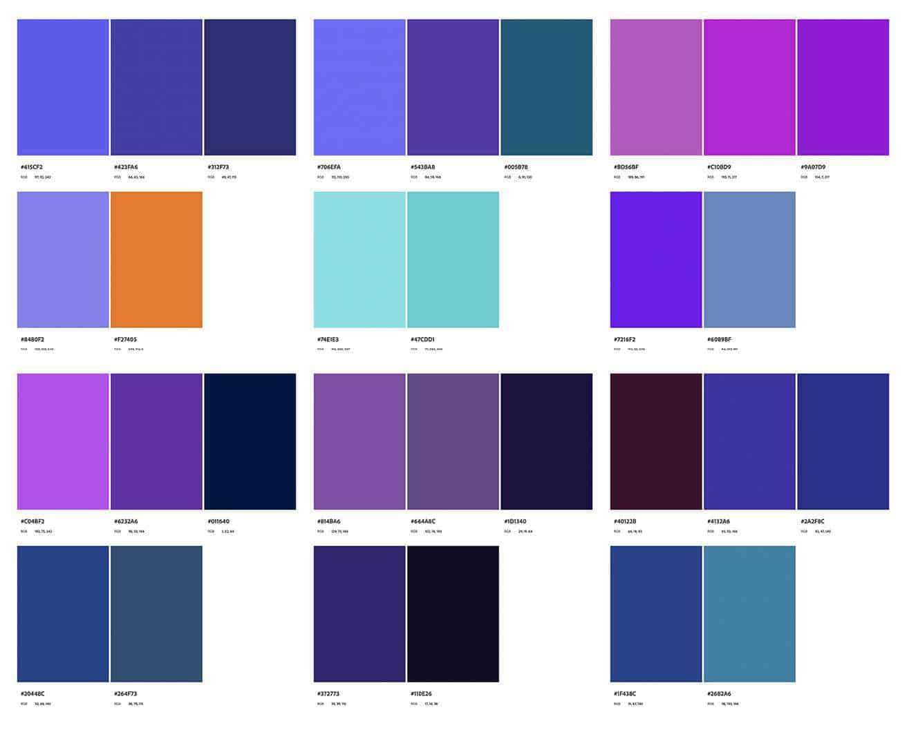
I typed in “space” (broad terms can give you a wider range of results) in the Keyword search and got a screen that looked like this:
So I scrolled through and saved these palettes to start:
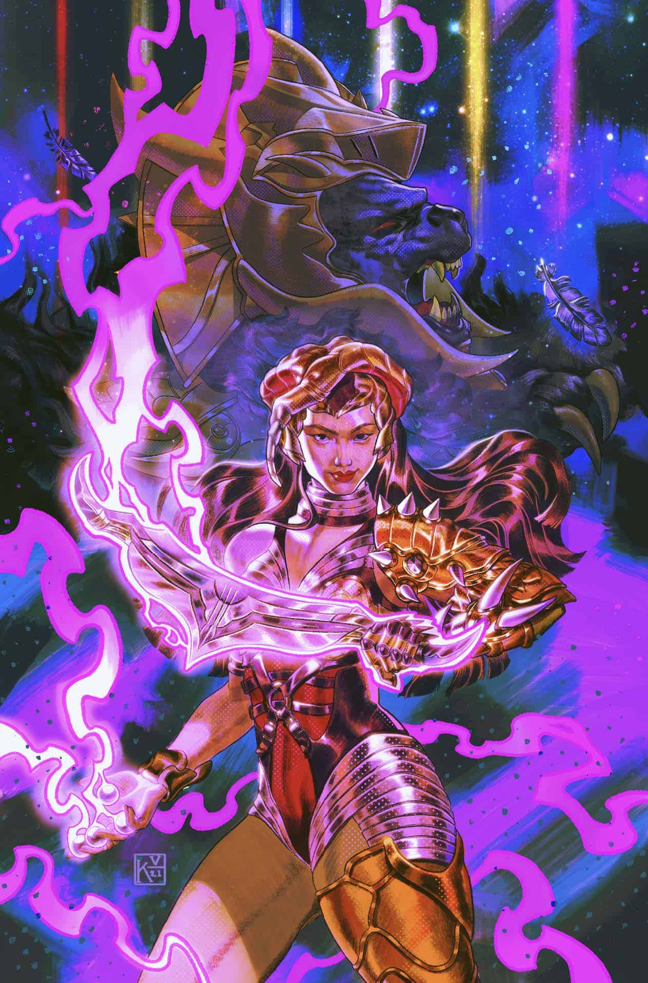
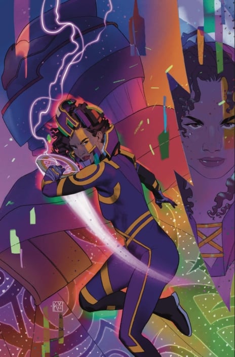
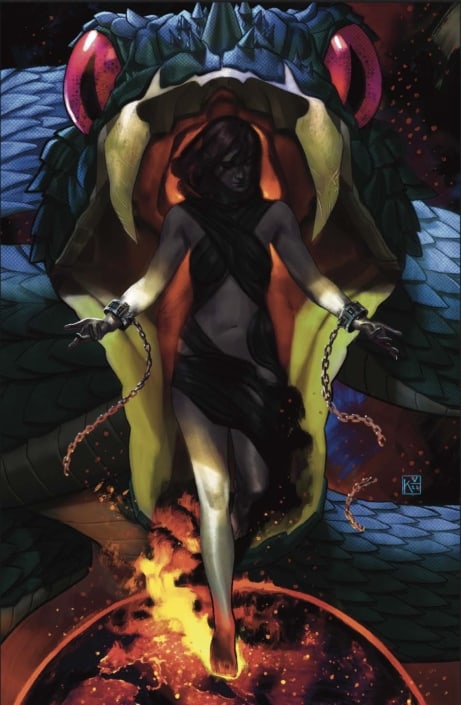
Originally my piece looked something like this. Nebulous, neon, saturated; I was so excited to have this bright purple.
However, I made an INCREDIBLY rookie mistake. My color profile was wrong and I was working in RGB, not CMYK (RGB is the DEFAULT color profile for Procreate and when you’re working digitally). With RGB you’re seeing color with light beaming behind it, so it looks bright. CMYK can be frustrating because you feel like the color isn’t as bold as you’d like. Unfortunately, ink has its limitations, and your program is making sure you stay within certain parameters (it also does this for web colors, but that’s going to be more prevalent for those creating only digital work not intended for print).
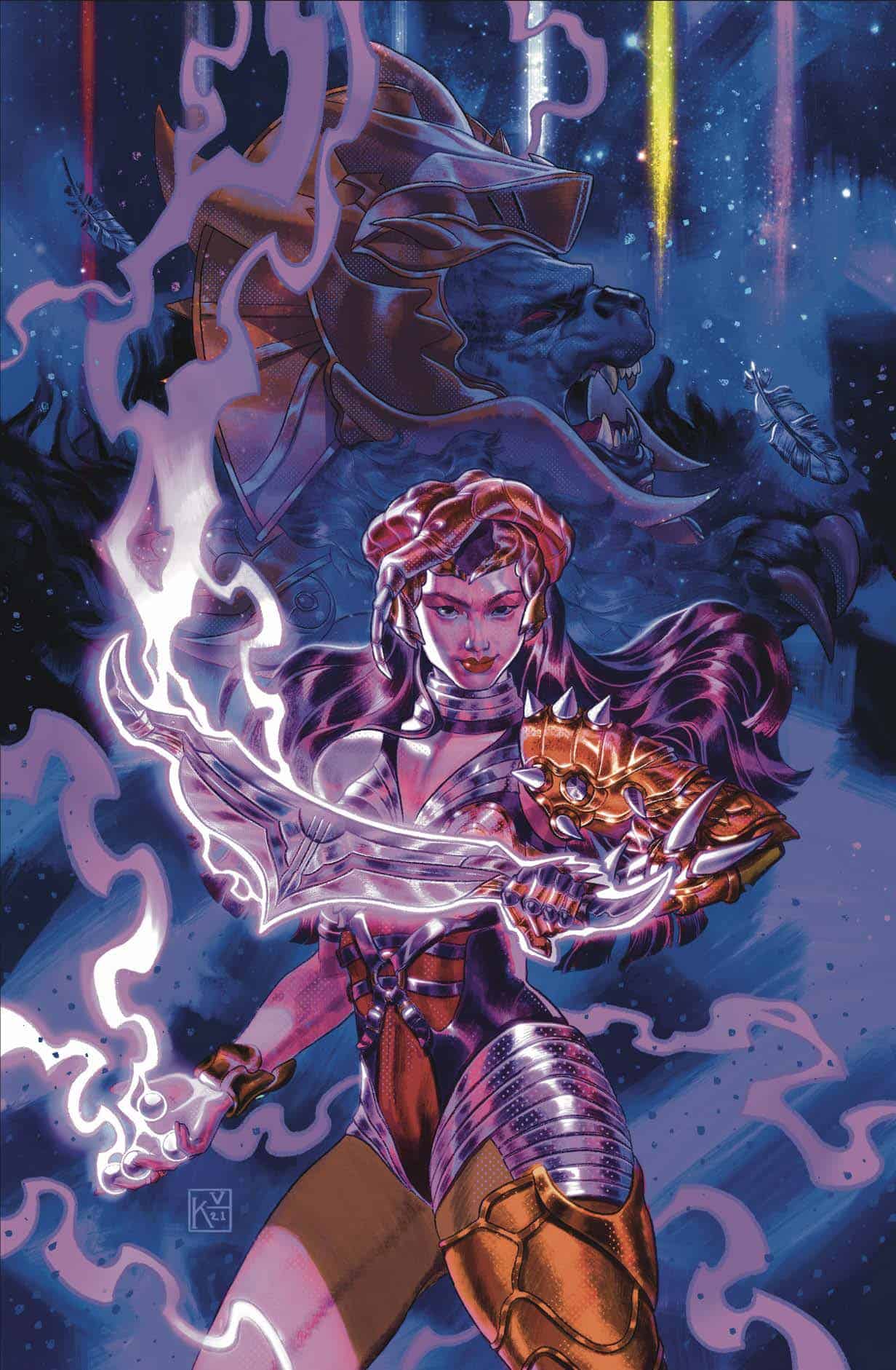
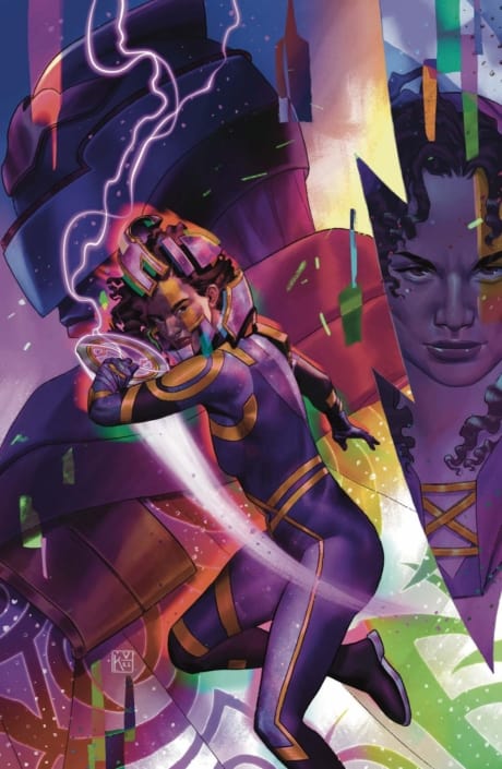
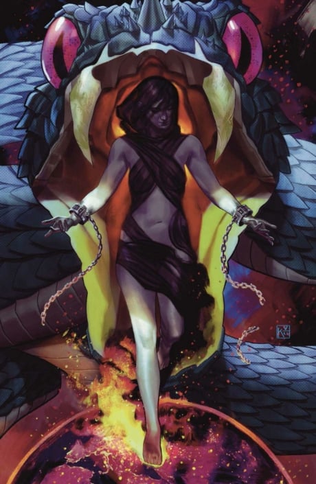
With that said, when I switched color profiles, it turned into this muck:
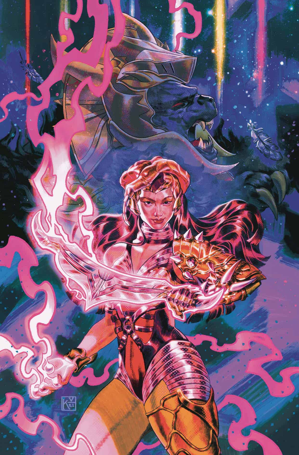
All my years working as a graphic designer, I wanted to scream, BUT I used Photoshop to my advantage. By playing with the Levels, Color Balance, and Saturation, I managed to make it into its own retro looking, 90’s poster inspired piece.
So, using this resource is easy but if you’re not working in the right color profile, you’re going to lose SO much of the intensity and color you desired.
The next thing I want to discuss is the overall color harmony of a piece.
Typically I work in local color, then use “multiply” layers for my shadows and middle values, as well as a mix of “soft light” or “hard light” layers for my lighter values. At the very end I do any rim lighting or more opaque light values.
I have two ways of achieving color harmony.
I sometimes work with my flat colors all sitting within a limited color scheme to create a unified palette. Once this is set, I add lighting and shadows, texture, and any extra glowing effects at the end.
My second way of achieving color harmony is a little more involved. It’s working in local color for an entire piece and using the “Curves” and “Color Balance” in Procreate. However, I’ll be showing how it works differently compared to Photoshop.
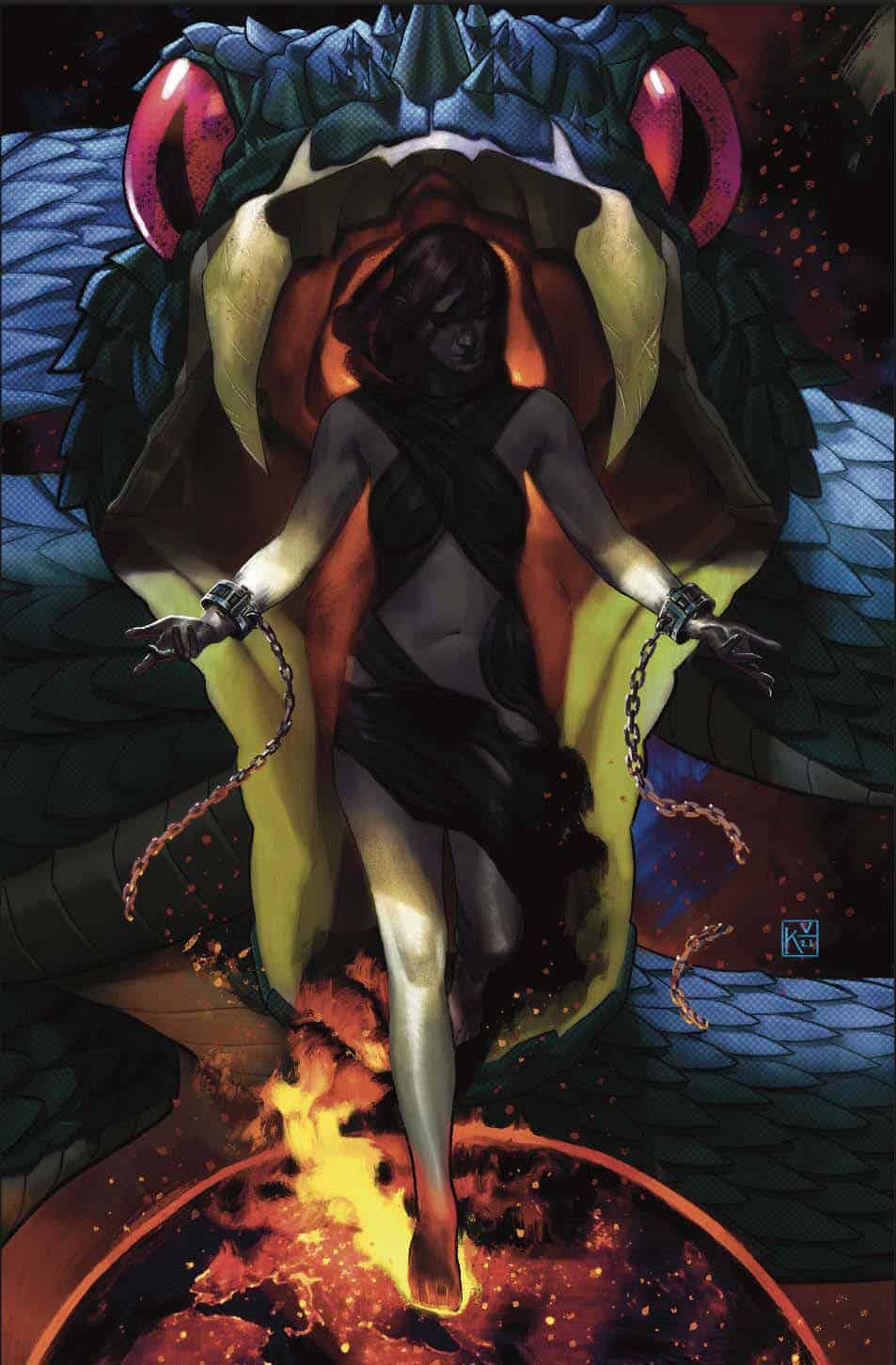
This is a cover for my “Rise of Dracula” series. Before playing with curves and balance, it was looking a little like this:
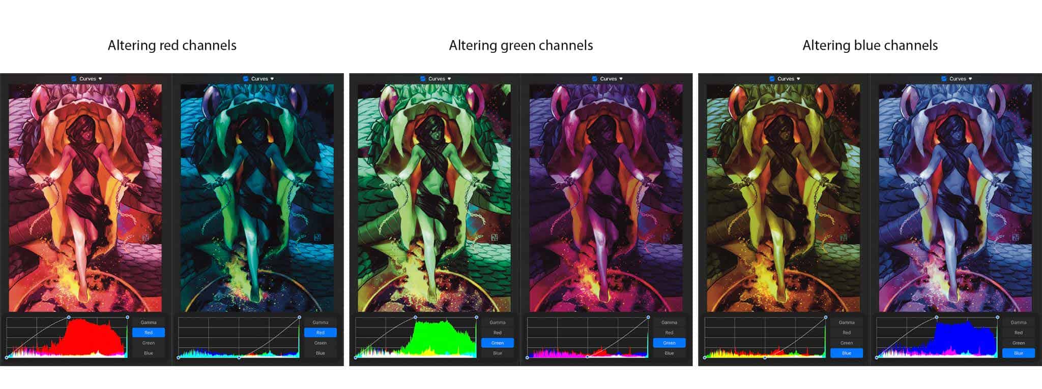
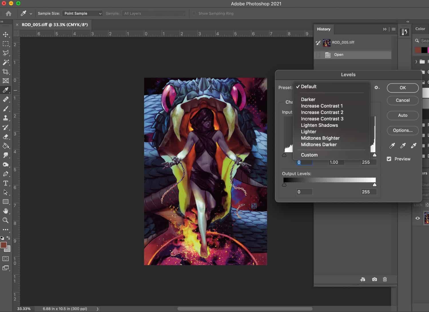
In Procreate, using “curves” is the equivalent of using “levels” in Photoshop. The biggest difference being that you’re still working in an RGB color range in Procreate, but Photoshop alters the channels based on your selected color profile.
This is what altering channels in Procreate looks like even though I’m working in a CMYK color profile for print:
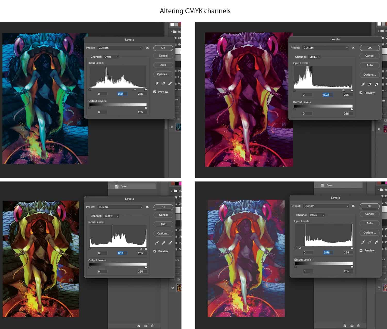
…and this is how it looks altering my levels in Photoshop whilst in a CMYK color profile for print:
The nice thing about Photoshop is that in “levels”, you can quickly alter your contrast and either brighten or darken your lighter/middle values.
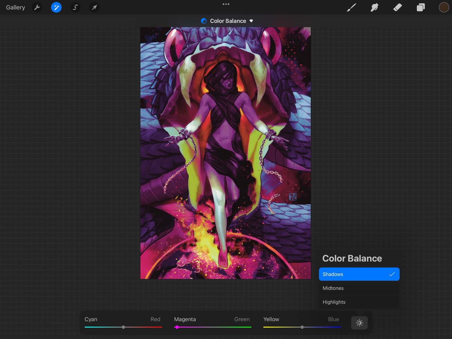
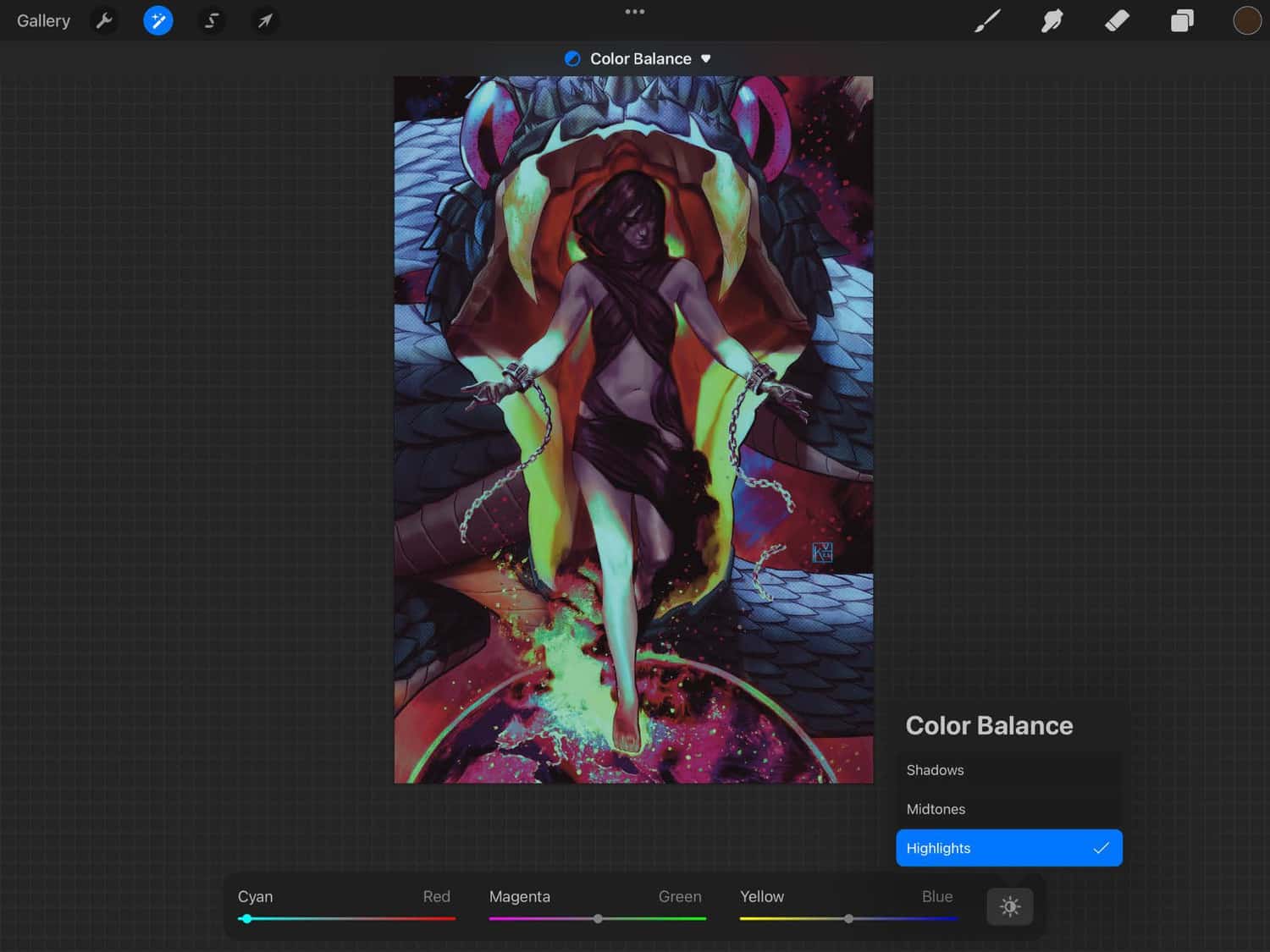
The final touch is bringing it all together by using color balance in either program. They’re labeled and organized in the same way.
Based on the environment and mood I want to capture, I mostly edit the highlight color and shadow color.
Editing the shadow color usually harmonizes really dark values and can add a little warmth even to solid black. After editing the shadows, I prefer setting my highlight color that’s completely different from my shadow color to offset them and create a more complex color story. Notice in the final on the right, I have more warmth in the shadows to contrast against the cyan in the highlights/lighter midtones.
One of the biggest things that I have to remind new digital artists in my classes is to remember that Photoshop was invented to edit images and add effects. I think there’s a misconception (which even I had when I was first learning digital), that you have to be perfect with color and lighting. That editing digital paintings like a photograph was almost like cheating; you didn’t actually understand color or lighting. This is so far from the truth and adds an extra layer of believability and interest to your piece if you just know how to use it in a way that fits your work.
Keyla Valerio
Illustrator, Educator, & Comic Book Artist





Leave a Reply
Want to join the discussion?Feel free to contribute!