Triadic Color Schemes
The Triadic Color Scheme is not only one of the most powerful color palettes you may derive from the color wheel, it is also my favorite color palette to implement for making images.
Brent Watkinson
How do I use Triadic Color Schemes?
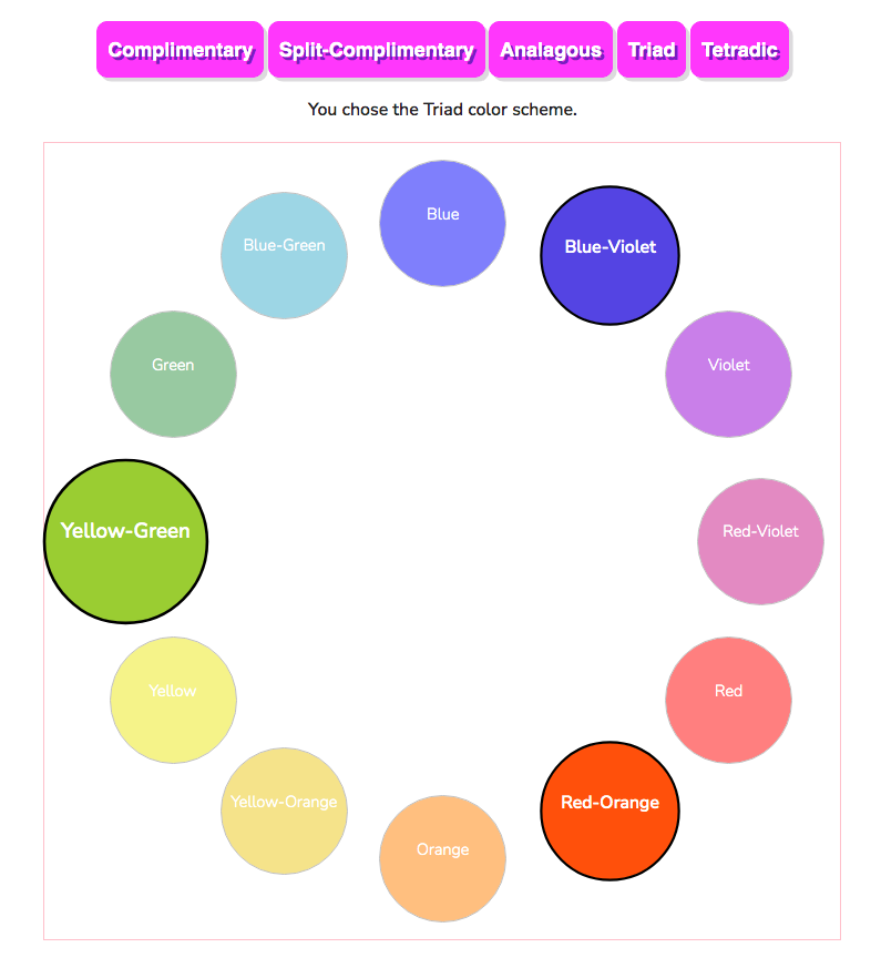
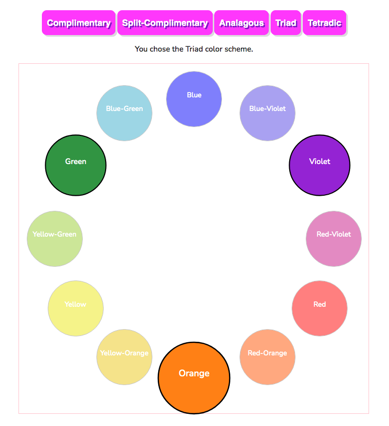
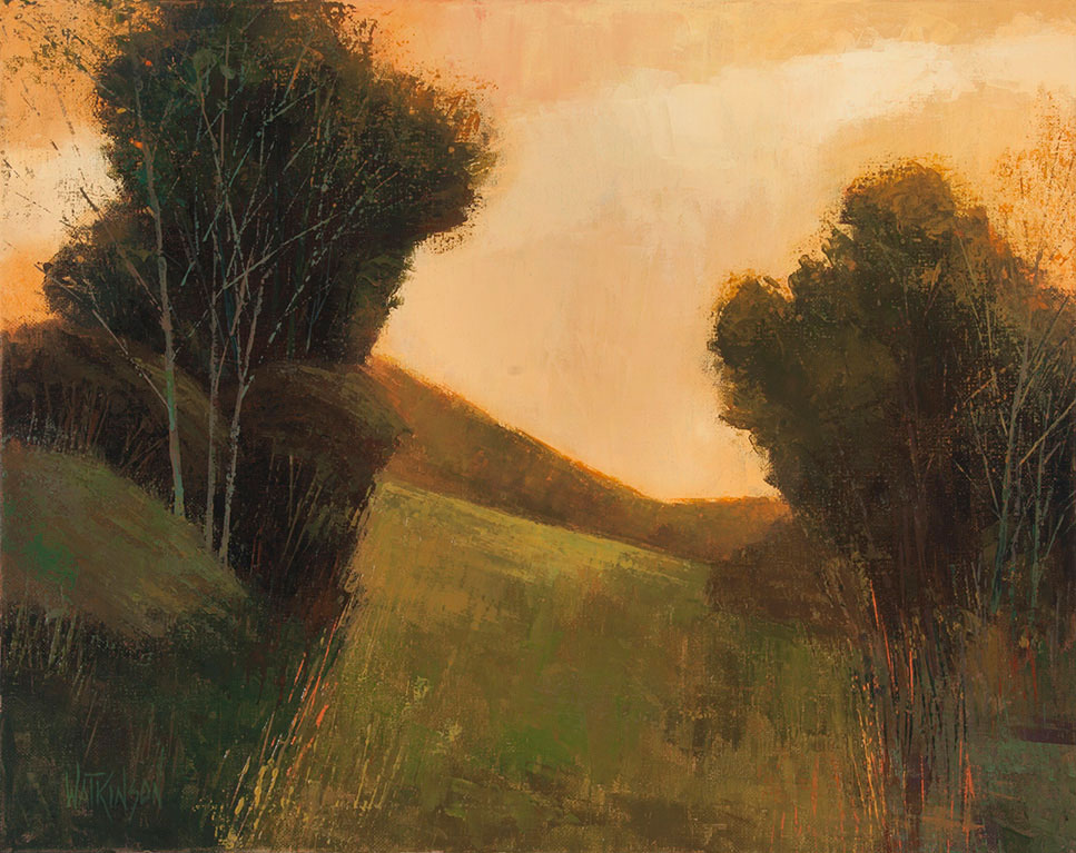
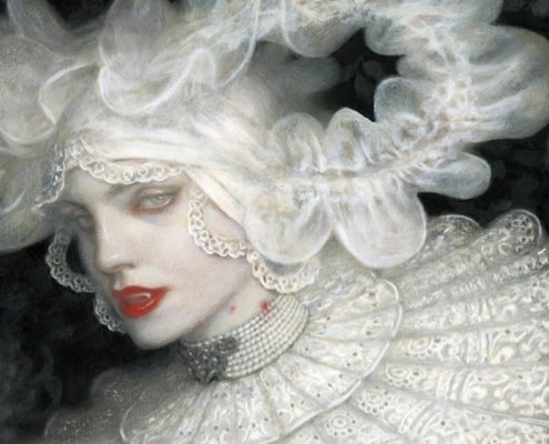
The image above shows us a Triadic color scheme of Yellow Green, Blue Violet, and Red Orange. This was achieved by simply choosing three colors, equally spaced. The colors chosen make the corners of an equilateral triangle. The colors are equal distance apart. This particular triadic color scheme is also quite sophisticated because it uses the Tertiary Colors that are far more interesting than using only the Primary colors, or the Secondary colors, which are also a Triad.
Blue, Red and Yellow
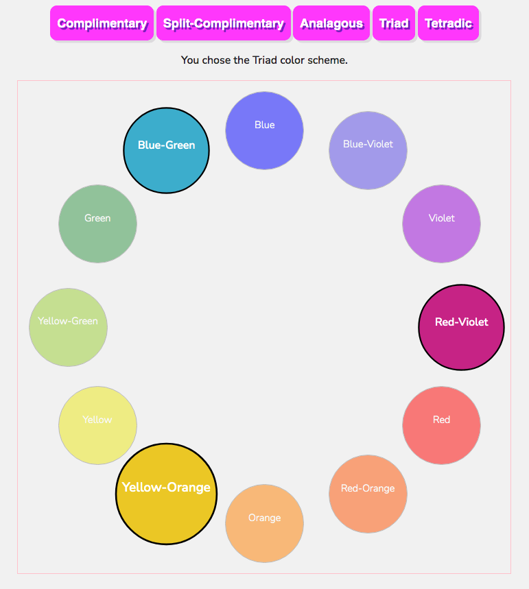
As another example, the primary colors of Red, Blue, and Yellow is also a Triadic color scheme. A simple and elementary one, but it helps illustrate how to divide the color wheel for a Triad. Again, the colors chosen are in the shape of an equilateral triangle. Below is an example of a Triadic Color Scheme using the Primary Colors of Blue, Red, and Yellow.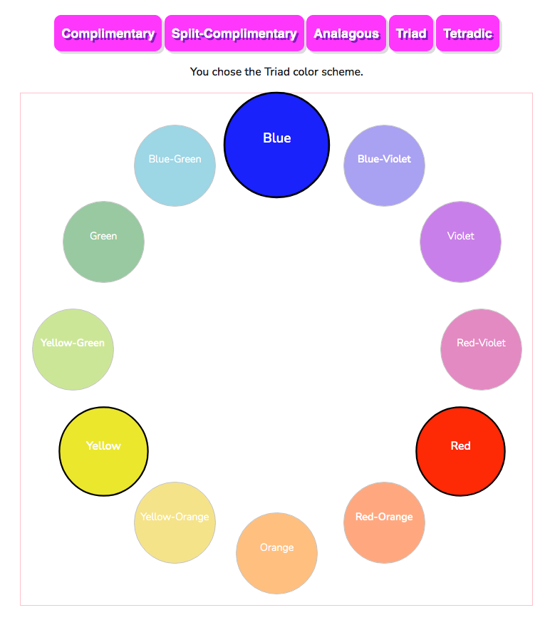
Using a triad of color lets us travel all the way around the color wheel, giving our eye and brain the “complete” color palette we crave. This concept gives us a more cohesive blend of all colors, from around the entire color wheel. Once again, note that one color is represented larger than the other two, reminding us to make one color more dominant in the cohesive blend of colors.
Use one color as a dominant color
Also notice in the first image above, that Yellow Green is a larger circle than the other two colors. This is to remind us that we need a dominant color when using ANY color scheme. When using a color scheme, keep the following points in mind:
- You may use any and all colors in your image, as long as the chosen colors of your particular color scheme are the DOMINATE colors. (Otherwise it is simply a bunch of random colors with no organization.)
- As pointed out above, one color should be the dominant color, and the other two colors are used to a lesser percentage.
- Think of your color palette as a main color or dominant color, with different percentages of “accent” colors.
Triadic Color Scheme Examples
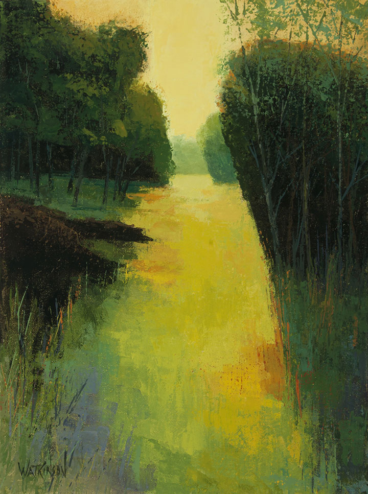
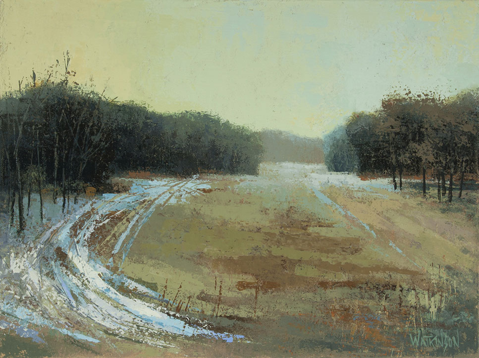
The Same Color Scheme, Different Saturations
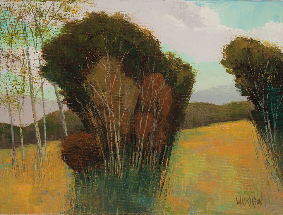
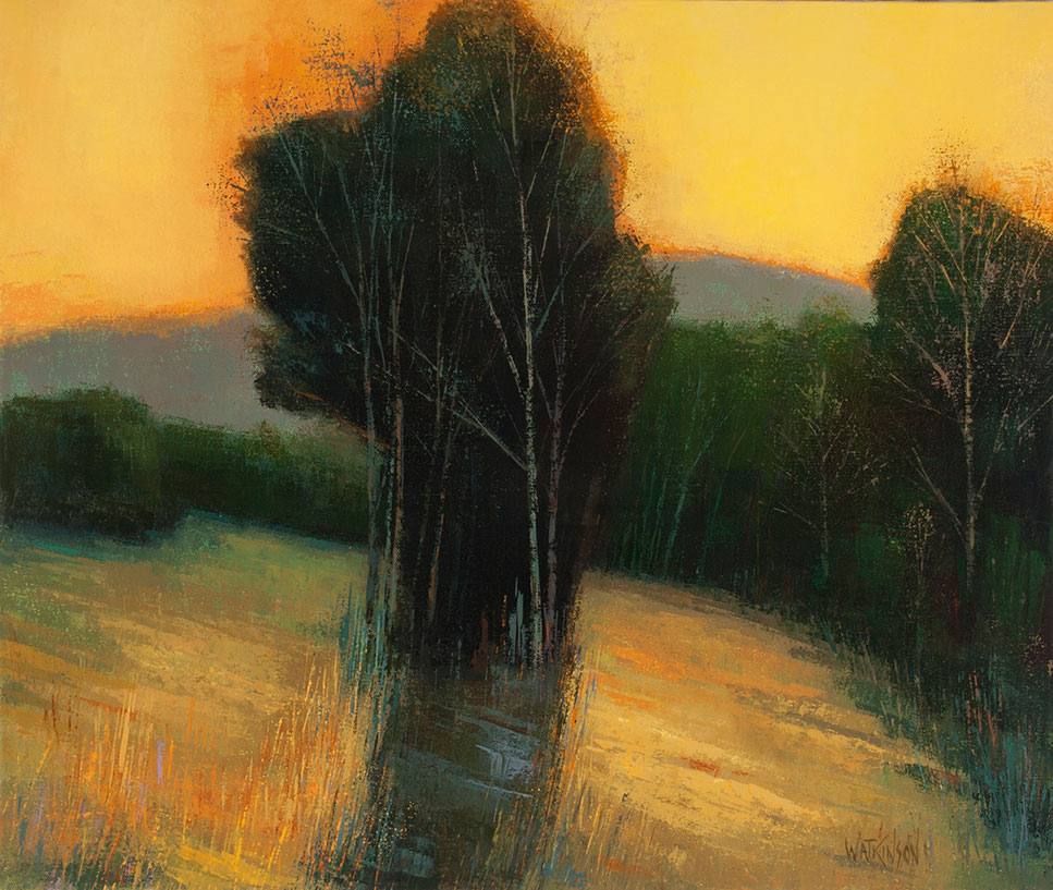
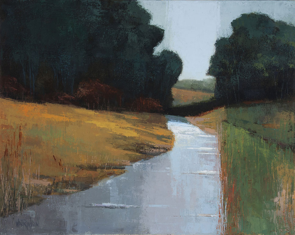
The paintings below are both examples of using a Triadic color scheme. The color scheme is the same as the one illustrated above in the first image, using Yellow Green, Blue Violet, and Red Orange.
Can triadic colors be toned down?
Both paintings use the exact same choice of colors, but the top image has bright, saturated colors, and the bottom image uses pale or unsaturated versions of the same colors. Same colors, different saturations. Think of using pastel variations as well for any color palette.
Using A Color Wheel
Color theory can be as simple or complex as you want to make it. I tend to keep things on the simple side, and have not found a personal use for taking a deep dive into the myriad of articles discussing optics and other hugely scientific thought processes. You must decide what level of scientific knowledge about color theory fits your personality and artistic needs.
Most artists, and especially students of art, get in “trouble” with color because of the following:
- They have never been taught how to use a color wheel, or how to look at it.
- They neglect thinking about color at all, until they are dissatisfied with the emerging color palette.
Part of having a color wheel printed out and tacked to your easel, workspace, or open as a digital file on your screen, is that you have instant access to the world of “organized color.” If you begin a project with a color palette in mind, you have already solved a major problem in picture making. You can always change your color scheme later, but STARTING with certain colors in mind allows you one less thing to worry about.
Also, as demonstrated in the two paintings above, if you chose your colors wisely, based on the color wheel, you can use any saturation and the color harmony will still prevail. You may use bright, saturated, day-glow colors and they will work together if they are the correct colors, coming from the color wheel. The reverse is true as well. You may choose subdued shades of the same colors and achieve perfect examples of color harmony.
You may also use a mixture of subdued, unsaturated colors in concert with brighter colors for an image that has some of both.
How does a color wheel actually work? It works by letting you perceive the spectrum of color that we recognize as humans. We see the “visible light” spectrum, also referred to as “white light”. Ideally, cohesive color palettes go across the color wheel, from one side to the other, OR “around” the color wheel to give the eye a complete color experience visually.
In terms of a triadic color scheme, the color wheel is divided into equal thirds, and gives the eye a sample of three colors evenly spaced, that go “around” the color wheel. Triadic color combinations can be as simple or sophisticated as you chose. Personally, I like using the tertiary color palette, and stay away from the more simple and primary colors of red, blue, and yellow. Tertiary colors are interesting because they are made up of the Primary colors and the Secondary colors, blended together.
Complementary colors are often used for images, but the psychology between a complementary palette and a triadic color palette is vast. The complimentary color scheme comes across harsh and aggressive, which can be of good use, depending on what you are trying to achieve with your image.
Triadic Color Scheme Feelings
My “color psychology” is more subdued and decorative. I prefer using a tertiary, triadic color scheme because that is my personal color vision when I create images. That is why color is so interesting; even in terms of interior design. Color is mostly emotional response. Some artists choose bright colors, while others are more involved in choosing subdued shades and tints for not only making images, but in terms of decorating their living space. You may prefer to be surrounded by colors that give you lively results, or a more cohesive blend of subdued hues that tend to be more calming.
Don’t shy away from triadic colors for other uses!
A lesser known way to use triadic color schemes is their power to desaturate each other. This is quite surprising to most artists, and is not widely known. Artists perhaps use this concept coming from their intuitive perception of color, but there is science behind it.
Yes, it is widely taught to use complementary colors to desaturate each other, and that idea is correct. This process can also be harsh and aggressive. A kinder, gentler way to desaturate a color is to use one of its triadic colors. With the exception of the triad using the primary colors of Red, Blue, and Yellow, any color in a triadic color scheme may be used to soften and desaturated another color in the triad. Yes, subtle color shifts may occur, but it is often a more appealing method than using the straight complement to desaturate.
Here is a simple, easy to understand example of how to use any color of a triad to soften another color of a triad. Let’s take the triadic color scheme of the Secondary colors: Green, Orange, and Violet.
If you want to desaturate or soften the color Violet, it is perfectly sound advice to go directly across the color wheel and use Yellow. This will make the Violet start going directly to a neutral brown, which is what will happen if you add enough of the complementary color.
This is exactly what will happen when you use ANY two complimentary colors…….when combined, they produce a neutral, or “brown” desaturated color.
However, if you use one of the other colors from the triadic scheme, perhaps Green, the Violet WILL be softened, and desaturated. The cost is that perhaps a slight color shift will occur, but will create a more vibrant, interesting, muted version of Violet. You may also use Orange instead of green.
With simple experimentation, you will find what works best for your color personality and your image. I can tell you that using Orange and Violet together are the perfect colors for painting gorgeous sunset images. Fabulous, rich, muted colors that are jewel-like.
Using this method will also insure color harmony. As always, a limited palette is the quickest route to color harmony.
How do I choose a triadic color scheme for my design?
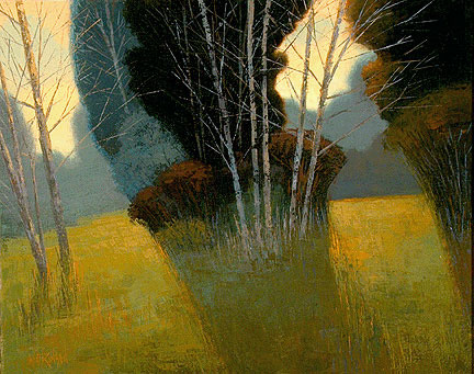
Triadic Color Schemes can be easily shifted by selecting another Tertiary Color and then subsequently locating the other two triadic colors. Below is an example of using Yellow Orange as the dominant color, and Blue Green with Red Violet as the other of the triad. This is also one of my favorite triadic color palettes. A golden yellow takes the lead, with the other colors being the other colors of focus in the image.
As always, any number of colors may be used, as long as your chosen colors are the predominate ones used. All other colors should be looked at as accents or supporting roles.
Here is an image painted using the triadic colors above.
The golden yellow of the Yellow Orange takes the role as the dominant color, with the Blue Green and Red Violet being less obvious, and fairly desaturated. Yellow green, red violet may seem like straight complements, but they are far more subtle. The third color of the triad, blue green, then becomes the sky color, which is the ultra-fine difference than using an ordinary blue for the sky.
ANY triad could have been used with this painting, because using a color scheme does the hard work for you. Triadic harmony happens automatically because the colors make sense to our human eye and brain.
Use triadic color schemes and the guess work of color is no longer and issue.
The Violet in the image above is extremely subtle and difficult to see on screen. The Violet used was unsaturated and used in the trunks of the trees.
The Red Violet of this image is subtle and whispered in. A good lesson on not having to strong arm the colors and hit the viewer over the head with color.

Brent Watkinson
Illustrator, Painter, & Educator
Color Theory Masterclass
Master your use of color, to elevate the mood, emotion, and impact of your illustrations

Color Theory Masterclass
Master your use of color, to elevate the mood, emotion, and impact of your illustrations

Leave a Reply
Want to join the discussion?Feel free to contribute!