The Fundamentals of Still Life Drawing
Brent Watkinson breaks down and demystifies the process and techniques of great still life drawing
Brent Watkinson
We all started as artists
Many art students and artists begin learning how to draw by drawing simple objects that interest them. This is most often before any art classes or formal training. The aspiring artist is driven to observe different objects, usually that are simple shapes, and record them with pencils, markers, or by any other means at their disposal.
What is still life drawing?
Inanimate objects are the perfect way to begin the exploration of basic shapes with visual interest, that are illuminated with a single light source. This is the essence of still life drawing.
Many regard still life drawing or painting as boring, or beneath them. The opposite is true. When creating a still life drawing or still life painting, I like to say, “There is nothing to hide behind.” This simply means that the art making skills of the producer of the work will shine through, as well as the weaknesses. Composition, drawing skills, shape, form, perspective, light and dark pattern; these things are the essence of the resulting image.
Still life objects, or still life subjects can be almost anything. Most often, simple shapes that are supplied by fruits, flowers, vases, bottles, and other common objects found around the house or home are a good place to start drawing. I was fortunate to have the opportunity to produce the covers of a national/international magazine that dealt with food and cooking. I did the cover art for eight years.
Digital Still Life Painting
Developing skills in digital still life painting is a powerful way to build fundamental and technical skills for drawing, painting, and composition in digital media.
Lake Hurwitz has worked with the most prominent names in the entertainment and game arts industry. In this course, Lake outlines the skills every artist should master to pursue a career in the arts, including setup, digital painting, polishing, and expressive rendering.
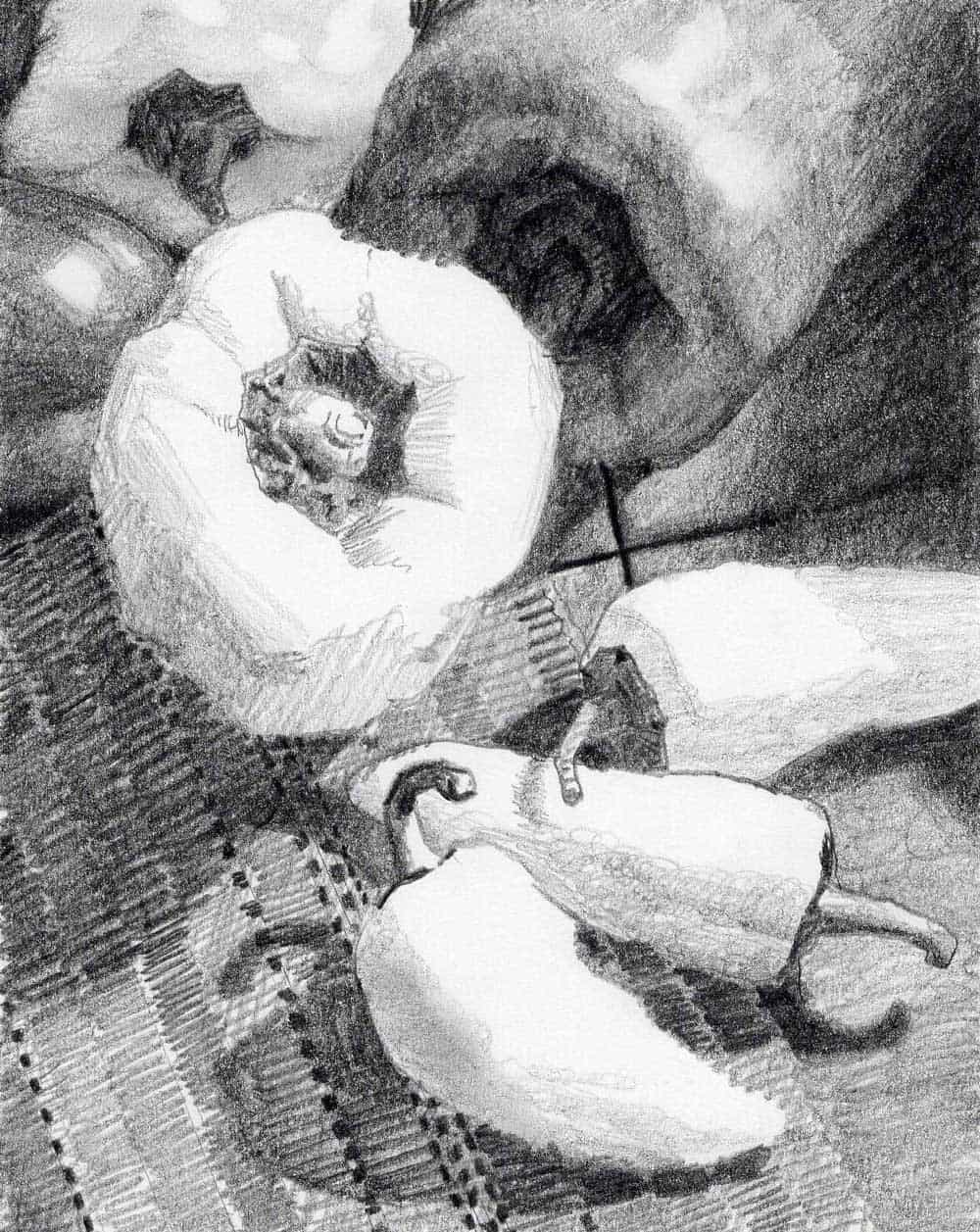
Image of Peppers on a placemat as still life and other objects. Brent Watkinson
The image above is a still life drawing that I used as a study before actually beginning the finished painting. Note in the still life composition above, the shapes are limited to two or three values. The objects register as “light shapes on a dark background.” In other words, the objects keep their shape and silhouette as a “light thing on a dark thing” which is key in image making. Still life drawing and painting is no different. The shapes must not be “broken” by using too many values, too far apart. If too many values are used in the construction of a shape, then the entire image will become a confusing “gray” mess, with no clearly defined shapes.
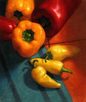
A still life painting of peppers, from a still life drawing. Brent Watkinson
The image above is the finished painting, constructed from observation, thumbnail drawings, the value study above, and photography. As an illustrator, each assignment was approached this way to ensure success and be on-time with deadlines. You can also see that the background was altered slightly to include tile, but the values of light and dark remained true to the drawing, to keep the shapes intact. The peppers read immediately as what they are meant to represent.
In regards to photography, I composed the objects and made drawings long before I took photos. Drawing my subject exposed mistakes in composition, light and dark pattern, tangents, etc. much more quickly than looking at photography.
Only AFTER I made successful thumbnails and sketches of my composition did I do the photography of the set-up. I needed good photography because the still life was made up of perishable items, and I usually was working on several projects at once. I needed to record the food items at their peak, and not let them deteriorate over the time I was consumed with other assignments.
Luckily, I was trained in photography as my first job out of college. Those skills came in handy for making my own illustration reference for many years.
Arrange and compose
Composition is perhaps the most important aspect of still life drawing. If your composition works well, the image will most likely be successful from a picture making stand point. I like to begin with quick sketches that literally take fifteen seconds or so to complete. Drawing small, quick images or thumbnails let you explore designs dealing with the overall light and dark pattern of your image.
Different mediums can be used, but good, old-fashioned graphite pencils work best for me. I know many artists that utilize the thumbnail idea using digital means. What ever medium you chose, do it quickly so you may explore several ideas. Actually drawing out the composition inside of a frame, or box drawn on your paper or digital file, will give you ideas about placement, scale, where lines intersect in either a good or bad way, (such as tangents), etc.
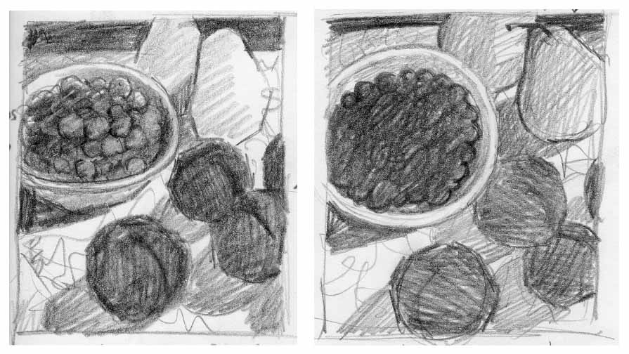
Quick sketches with graphite pencils as a study for a still life painting. Brent Watkinson
The thumbnail sketches above show how I can quickly register the shapes of my still life objects as simple values. Light on dark, or dark on light. These particular objects are drawn as dark shapes on a lighter background.
Even though most people think of pears as “light objects”, here I have chosen to eventually make them slightly darker than the light fabric under them. These images are for my eyes only, not for art directors. They are rough, quick, and I use them to explore options of light and dark. These are the quintessential building blocks of image making.
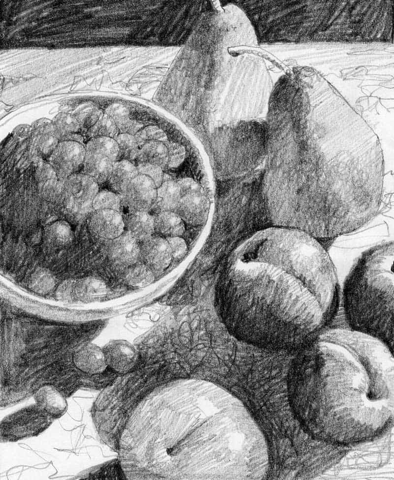
Still life drawing of pears and plums on light fabric. Brent Watkinson
The next examples, (above), are dealing with more refined light and shadows, which also become part of the composition. The forms will still read, but as always, the values are kept close together to maintain the shape and silhouette. Small changes of perspective are explored, as well as placement and overlap of the objects.
A detailed sketch of pear, nuts, and cranberries, with more progress for the finished art. Brent Watkinson
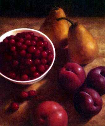
With the composition finalized, here is the resulting drawing of the still life composition. For variety, I decided the make the lower, center plum a “light thing of a dark thing” instead of the reverse for the others. Note that it still registers as a simple shape, with interpreted values to maintain the integrity of the shape.
Using inspiration from the sketches, here is the final result. Brent Watkinson
The color version is the final painting for the cover.
Special note: The images I painted for the cover were “floated” on the cover of the magazine, which meant there was no type or titles actually touching the image. This gave me the freedom of creating a piece of work with no restrictions of lettering.
Light and dark
As demonstrated above, still life drawings of inanimate objects can be as diverse and dynamic as you want them. Inspiration can come from the love of subject matter, composition, the play of light and shadows, or just a means to enhance your picture making skills. There are many different ways to think about and approach still life drawings and paintings. I personally like using shadows to help overlap objects and to give a subtle interaction between the objects.
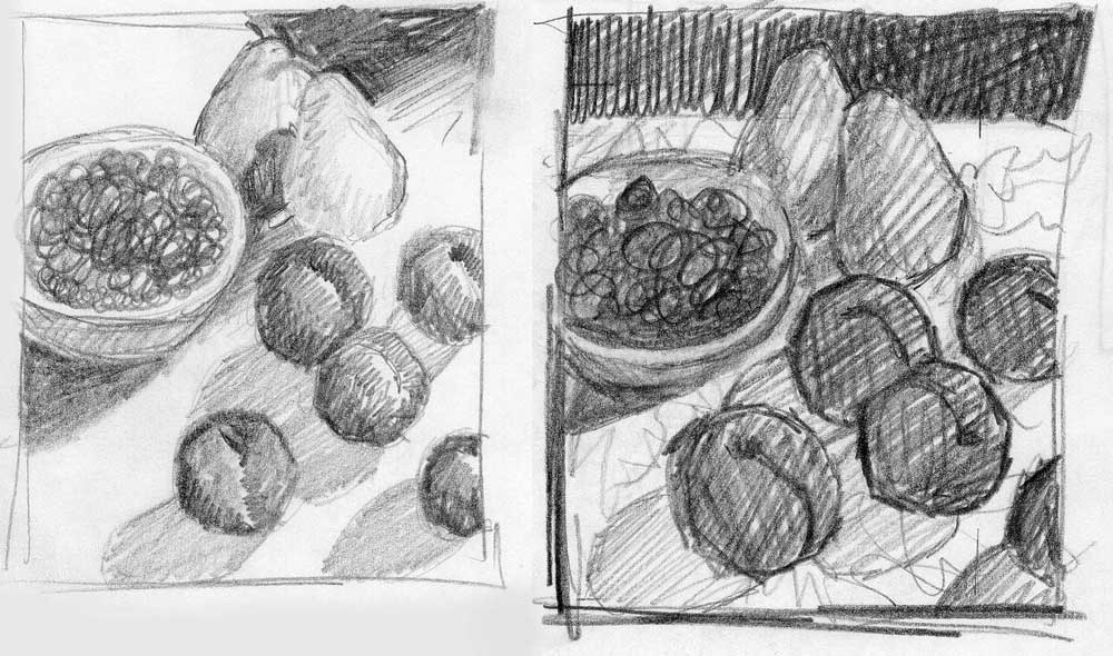
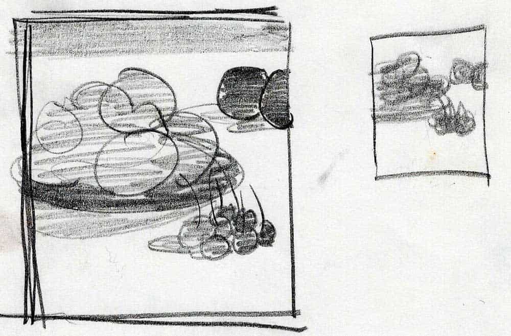
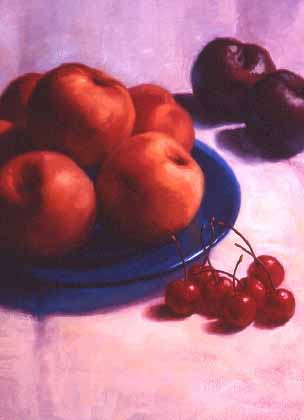
“Stone fruit” still life as a great subject. Brent Watkinson
The thumbnail images above were made with graphite pencils on tracing paper. The sketch on the right was my quick, responsive reaction to the still life I had set up in my studio. I wanted to explore if I could create a simple light and dark pattern using a single light source. The next step, on the left, was to show a little more of the actual shapes I was using, plus adding a dark section on the top of the image to imply a background or shadow. I was basically using the dark at the top to divide the space in an interesting way, and to hint at additional space behind the subject matter.
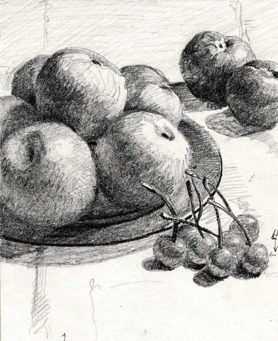
Stone fruit final drawing created to help in the process of the cover art. Brent Watkinson
Now I have added subtle details, while retaining the original value study of darks shapes on a light background. Also note the effect of the transparent glass plate, showing its own cast shadow through the edge. Even though the shapes are showing form, the values are carefully constructed so the objects remain a “dark thing on a light thing.” It truly is that simple.
With the knowledge of keeping values close on objects, the image will read quickly and correctly. Too many values on an object will destroy the focus of the shape. However, you may use a “reversal” of values, which is often used in figurative and portrait work. For these paintings that I was commissioned to do for the magazine, I wanted the shapes to be able to be read and recognized immediately.
The final still life painting of the stone fruit used as cover art. Brent Watkinson
It is readily apparent that this still life is a collection of “dark things on a light thing.” The values of the objects are kept close enough to maintain their shape. The only exception is the light portion of a couple of the peaches becomes lighter than what is behind them, but the shapes are still intact and read quickly.
Evolution
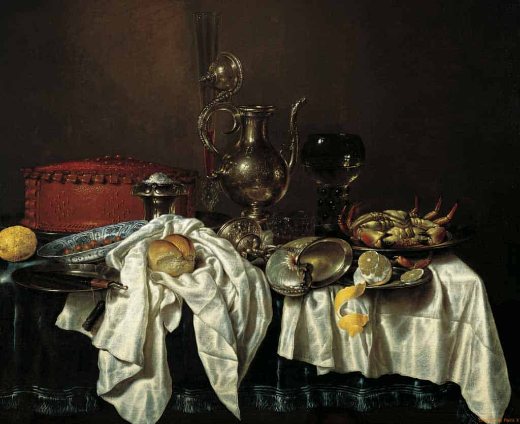
As a bit of historical context, still life paintings were often used as “status symbols” by the elite members of society. Much like luxury cars, boats, or homes are status symbols in our modern world, a still life painting depicting the owner’s expensive belongings, were a way to show off to guests entering the home. Right away, a visitor could gaze upon the glorious gold or silver objects, expensive vases from the far corners of the Earth, or a rich table setting of exotic fruits and foods imported at great expense.
Still life of luxurious items by Willem Claesz_Heda.
This painting is titled “Still Life with Pie and Silver Ewer”, by Willem Claesz Heda. “Ewer” is a word meaning “a jug with a wide mouth.” You can see expensive objects that the owner of the painting is trying to show off to his friends and neighbors that visit, lest any of these objects were not in plane site, or, (heaven forbid), tucked away in a cupboard out of view. A beautiful, ornate salt cellar, a Chinese dish, a flute glass for expensive liquor, and exotic shellfish and citrus fruits.
The owner is showing his wealth and taste with this image, as well as illustrating how well fed he and his family must be. In reference to the salt cellar, remember that for centuries, salt was often used as currency, and was terribly expensive. Thus, showing you have plenty at your disposal represented wealth.
Different styles
“Still Life with Pie and Silver Ewer” was a popular choice of still life images around 1640, when the painting above was created. Images like this example were so popular, there was even a term for them. “Pronkstilleven” is a Dutch word meaning “ostentatious”, “ornate” or “‘sumptuous” still life. It became a style of still life painting that depicted ornate and luxurious objects meant to show wealth and taste of the person commissioning the image.
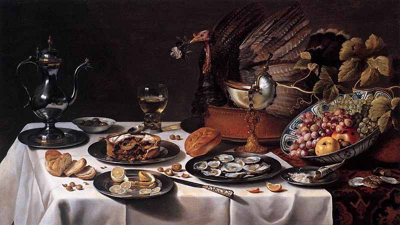
Still life with Turkey Pie, by Pieter Claesz. 1627.
Above is another “pronkstilleven” showing great wealth and luxury. As a side note, even though still life drawings and paintings show inanimate objects, they often hint at humans being close at hand. For example, the citrus above is peeled, the oysters shucked, the bread is baked, and the turkey pie has been sampled. Who did these things? These ideas illustrate the fact that indeed there is most likely human life consuming and producing this arrangement.
Still Life and More
Not only do still life drawings and paintings stand alone for the reasons we have discussed above, but they can also be a solid and important component of another work.
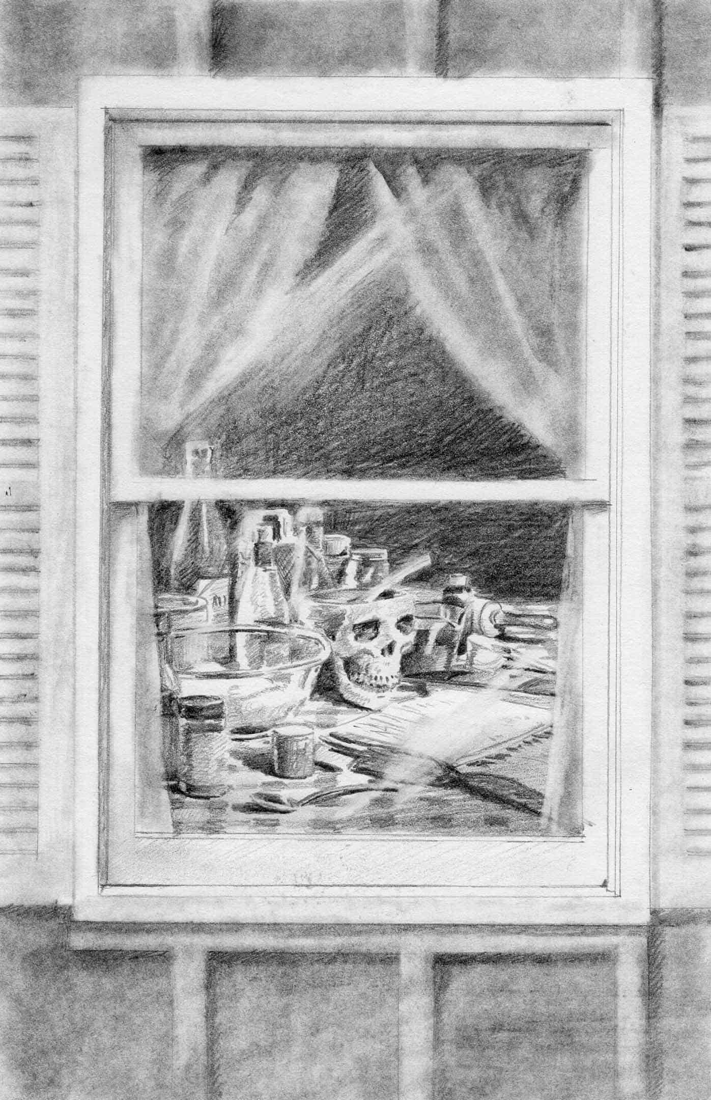
Example of a still life being used as a component of a larger image. Cover art for “Recipe for Death.” Brent Watkinson
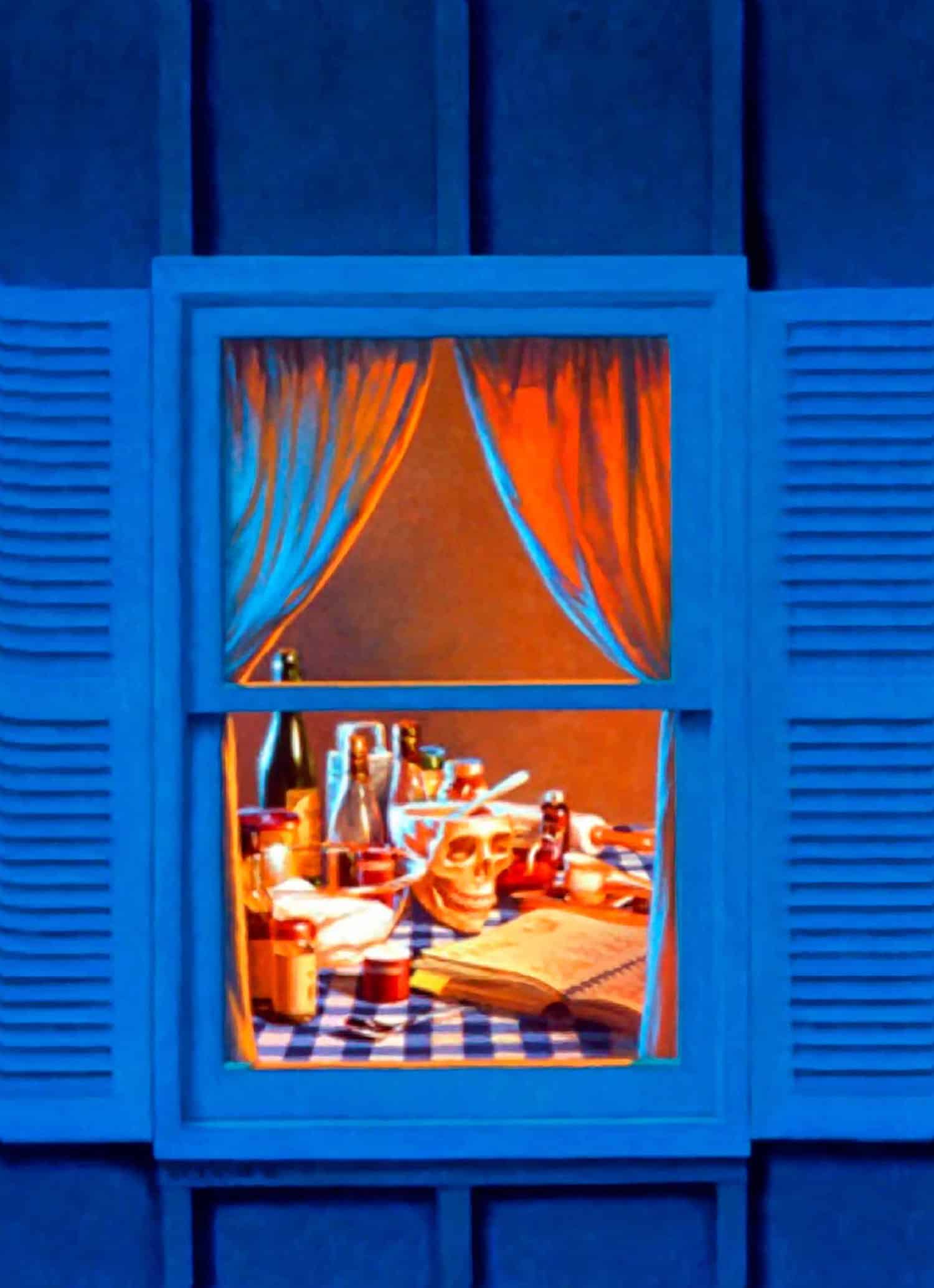
This image uses a still life as an element in a larger image. The ideas was to create a group of inanimate objects that depict the kitchen or laboratory of someone mixing some sort of concoction to act as a poison. The mixing bowl is of course a skull where the deadly ingredients are being prepared.
I first began by grabbing practically everything I owned in my kitchen, and assembled them on a table in my studio. I then began to design and arrange the objects into what I thought would be a thoughtful shape that would work in the final painting.
Beginning with this drawing, and exploring the values, was key to the success of the final art work, due to the complexity of the overlapping glass bottles and bowls. Drawing one object in front of another, compounded by the transparency of the glass was challenging to say the least. It was far easier to assemble these objects and draw them first, than to try to begin a painting with no focus on practicing and exploring the light and shadows. I would never attempt anything this complex without using a drawing to begin the process of understanding how these objects would work together as a unit.
In this case, the initial composition of real life subjects let me use light and dark to make a drawing that would convince the eye. It was a textbook example of needing to become familiar with my subject.
A still life being used as a component of a larger image. Final cover art for “Recipe for Death.” Brent Watkinson
The example above is the final cover art for a book cover. This was created using a still life as the main subject of the art. Painting many glass objects in front of each other was a challenge that truly needed the act of drawing as a precursor to beginning the actual painting.
It would have been impossible for me to conjure all the details of lights, darks, and highlights in this image that were necessary to make the still life convincing. It was created using pure observation of a group of objects.
Another Example of a Still Life Drawing as a Component
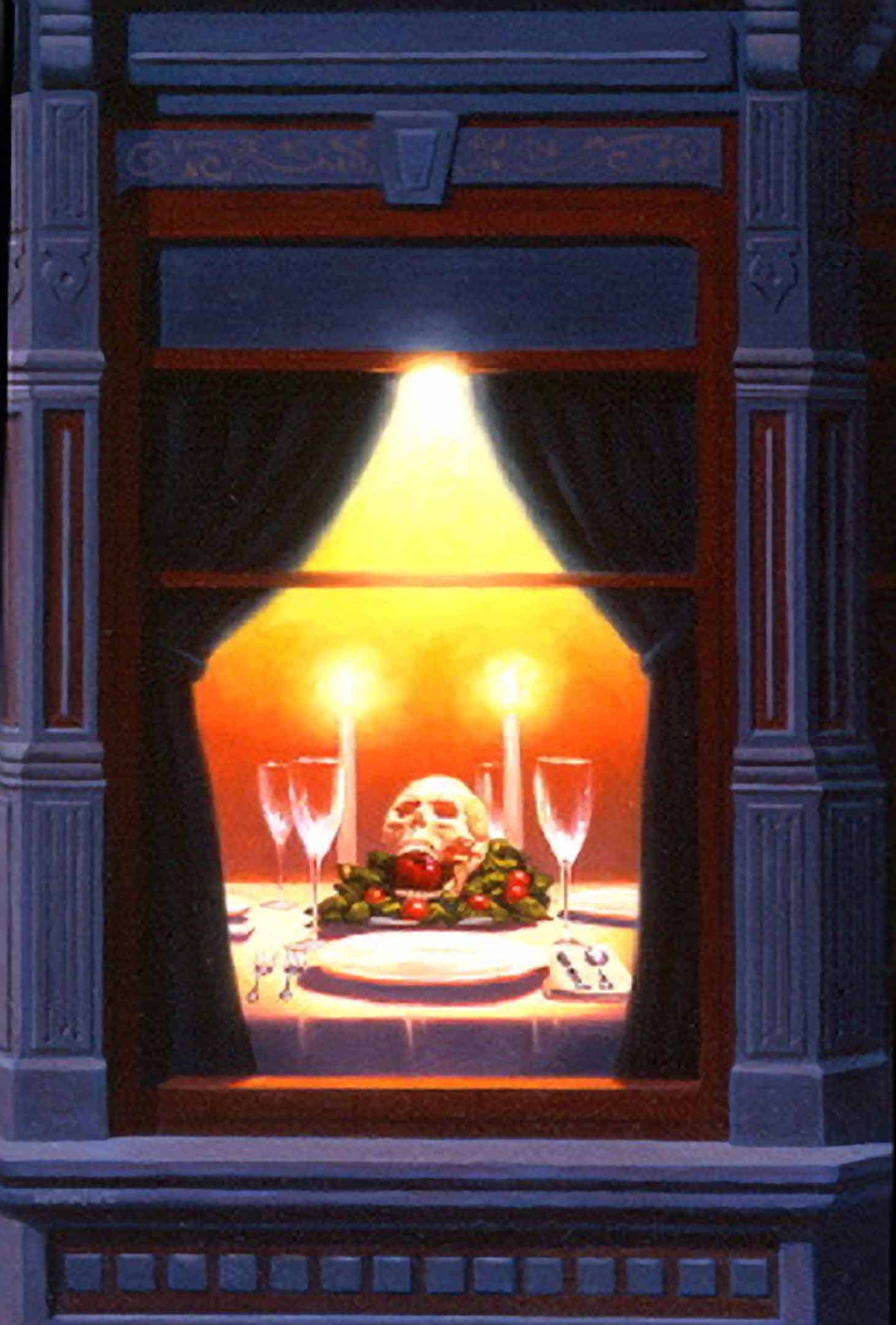
A still life being used as a component of a larger image. Final cover art for “Hotel Morgue.” Brent Watkinson
This example uses a creepy “Memento mori” subject as the basis for this book cover art. Memento mori is a Latin phrase meaning “remember you must die”. It is any drawing or painting that contains a skull in the collection of objects for the still life.
This painting used an elegant table setting, with a harsh overhead light, as well as candles to create the warmth of the interior. The exterior could perhaps also be thought of a type of still life, depicting a Victorian facade.
Below is the finished book cover.
A still life being used as a component of a larger image. Final cover art for “Hotel Morgue.” Brent Watkinson
More Examples of Drawings Used as Exploration Before the Finished Paintings
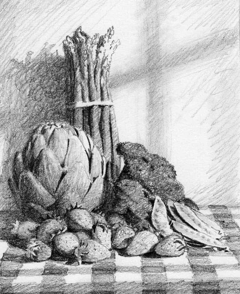
A collection of objects assembled in the studio as still life. Final cover art for a magazine cover. Brent Watkinson
A drawing of vegetables used as subject matter for a magazine cover.
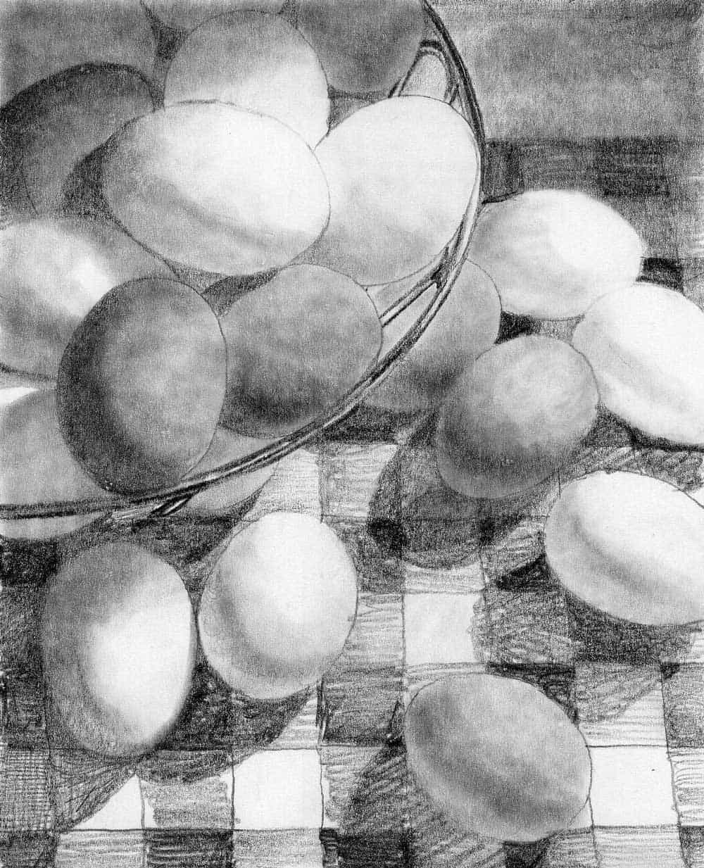
A drawing of eggs, assembled in the studio. Final cover art for a magazine cover. Brent Watkinson
This drawing was a particular challenge because all of the objects were the same size and shape. To make the composition interesting, I of course made groups of the objects to give the perception of large, medium, and small.
A single egg “object” was used as a small shape. A group of two eggs, or five eggs, became medium sized shapes. The eggs in the wire basket became a large shape. This is important, and can be used for any subject in which all or most of the objects are the same or similar in size.
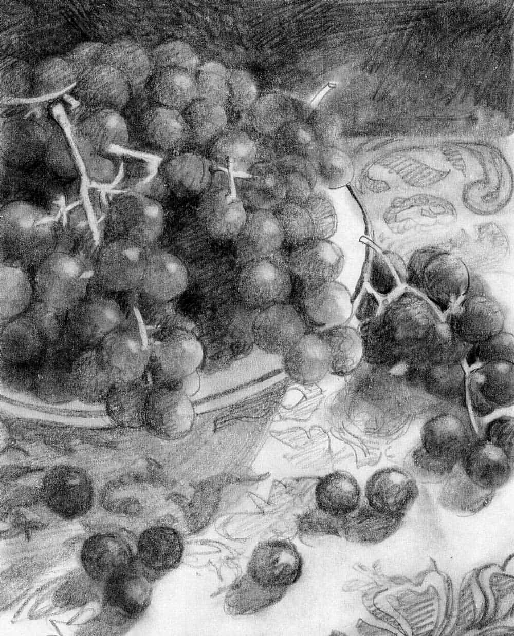
An image of grapes, assembled in the studio. Final cover art for a magazine cover. Brent Watkinson
Another example of using forms and shapes that are similar in size to emphasize teaching how to create groups as objects. To form variations of perceived size, think about small, medium, and large shapes on the picture plane, as you add and subtract your items.
As stated many times previously in this article, the grapes are “dark things on a light thing.” It sounds simple, but this cannot be emphasized too many times.
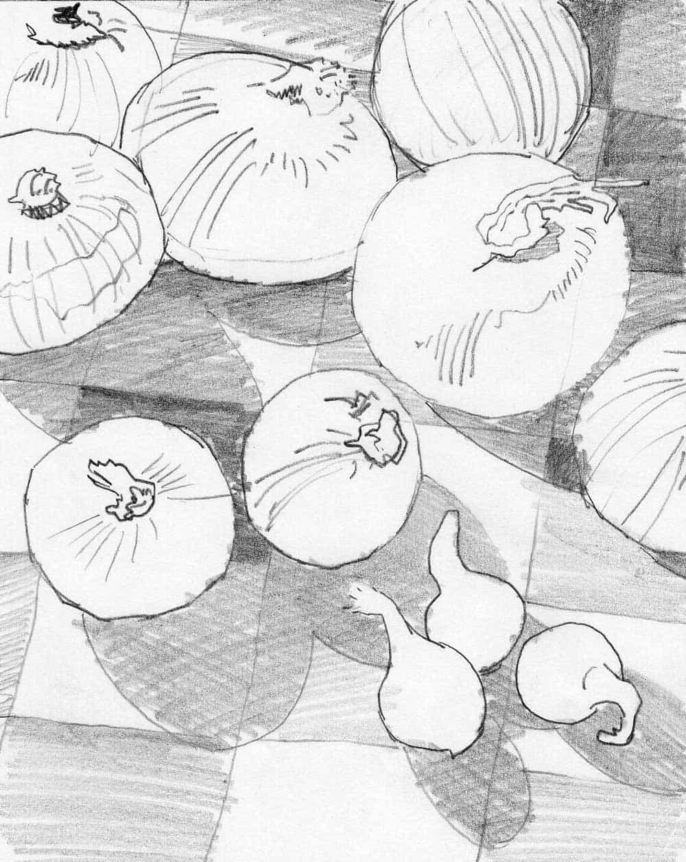
A drawing of onions in the studio. Final cover art for a magazine cover. Brent Watkinson
This sketch was for my eyes only, as an exploration of light and dark, with a pattern, using a single light source. There is no rendering, no real form, but trying different objects of size and shape. Yes, all of the objects were onions, but the differing sizes and shapes made the composition far easier than with the eggs and grapes. Squint your eyes and you will see the subjects are light objects on a darker background. Small, medium, and large was all I needed to think about.
A Final Thought
Remember to use basic shapes, use a single light source, and keep the values of objects relatively close together so they do not “break apart” because of too many values.
Think in terms of either a “light thing on a dark thing”, or a “dark thing on a light thing.” Your picture making will become stronger if you do. It can really be that simple.
Creating so many still life drawings and paintings did a good job of teaching me not only about composition, but about overall picture making. As I said before, when dealing with still life, “There is nothing to hide behind.” Your strengths and weaknesses will become apparent, and that will help you progress to the next level of understanding and achievement.
Brent Watkinson
Illustrator, Painter, & Educator
