Comics & Sequential Art: Designing Your First Panel
Bill Koeb
Comics, sequential art, graphic novels, visual narratives, whatever you call them, they are a combination of words with pictures that usually take the form of panels on a page. Designing your first panel can be a daunting task. With effort, and imagination you can get there and be off drawing your own comics in no time.
First Impressions
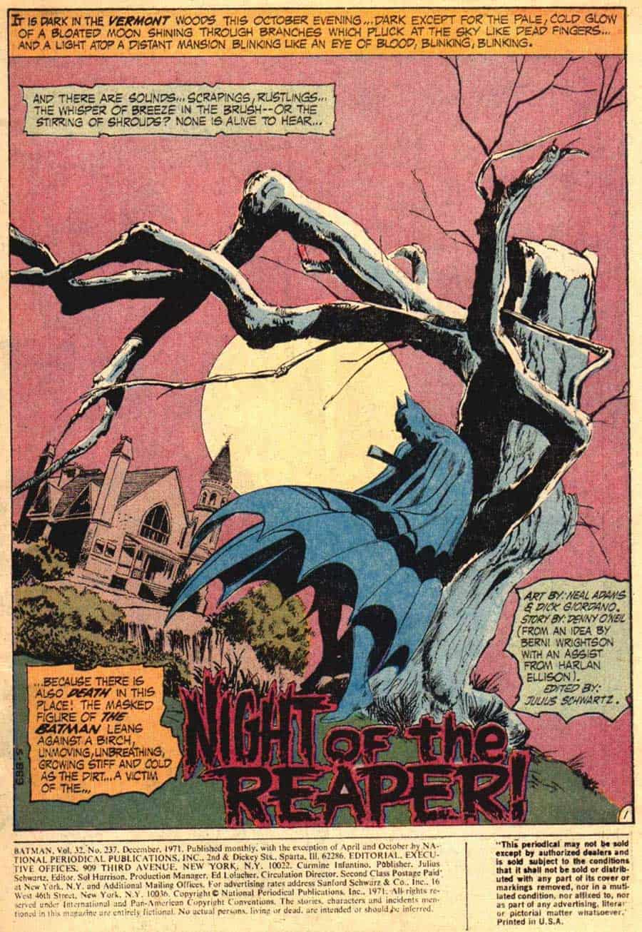
The panel shown above, from Batman issue 237, written by Denny O’Neil, penciled by Neal Adams, and inked by Dick Giordano is the first comic book image I remember. I was six years old and suffice to say, it left an indelible impression on my young brain. It’s page one, panel one of a comic that seemed to come to life for me like a movie on the pages. It’s one of the best first panels that I’ve seen and right away it draws you in to the story. The panel above is a hard one to beat, and it’s from a time when comics were shaken up by new creators and readers were jolted out of their seats by dramatic art and edgy writing.
Beginnings
You have a story that you want to tell, you have your characters defined, your plot outlined, your pencils sharpened, and a stack of paper that is ready and waiting to bring your words to life as a visual narrative, a comic book. Now what? Well, you need the first panel on the first page.
Page one, panel one. I’ve read these words on every script I’ve worked from. Many have started with an establishing shot, while others have begun with a full page close up. I’ve seen many stories unfold in mid-action, where an event is occurring and we are along for the ride. Understanding panel design, and some of the options available can be a great help to those wanting to create comics.
Establishing Shot
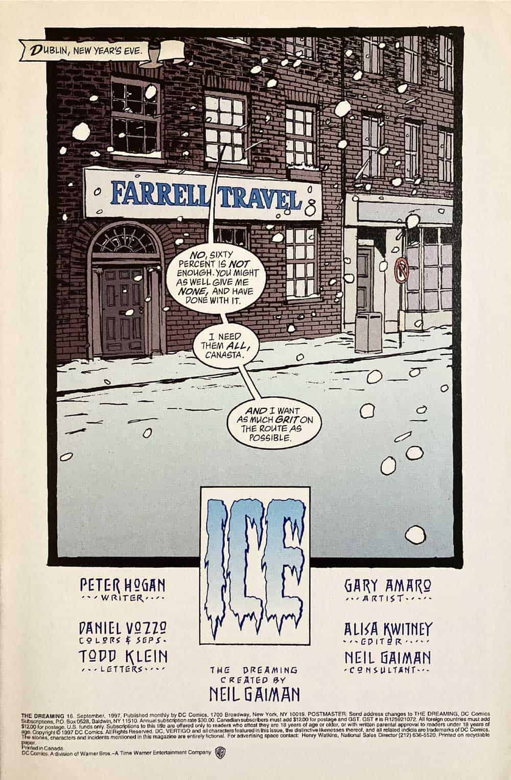
The establishing shot in comics is the “It was a dark and stormy night” or “A log time ago in a galaxy…” shot. In sequential art, as in movies, an establishing shot is a picture that shows us where a story is happening. It can also show us who our players are, and what they are doing. Most often though, it sets the stage for our narrative. It brings us to the place where events are about to unfold. Whether it be a dark castle atop a hill at night during a thunderstorm, a cottage in the woods, or in a valley, filled with wildflowers, trees, and singing squirrels. This is the panel that lets us know the where of things. Often, establishing shots contain expository captions telling us where and when we are and what is going on.
Close Up Panels
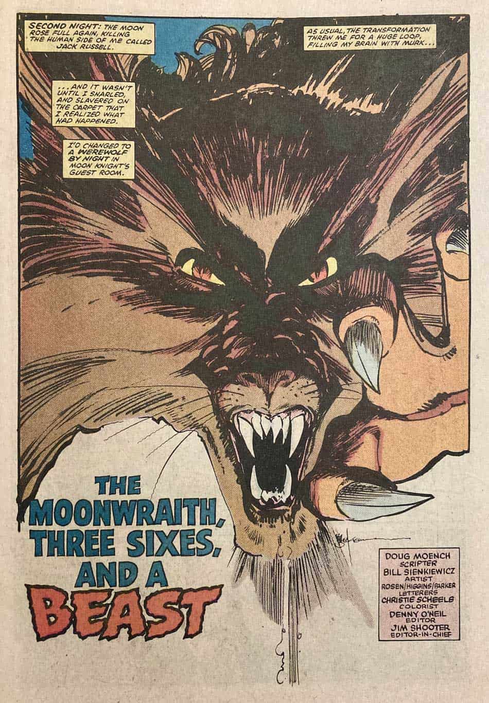
A close up is a panel that shows us something extremely close. The comic Moon Knight issue 30 by writer Doug Moench and artist Bill Sienkiewicz opens with a visceral and expressive close up of a werewolf, who is narrating the scene via captions. Through this narrative device we learn who the werewolf is, where he is, and has just occurred. The close up needn’t be limited to showing the face of a character. Imagine the impact of a tensed hand reaching toward the unknown,
Medium Shot Panels
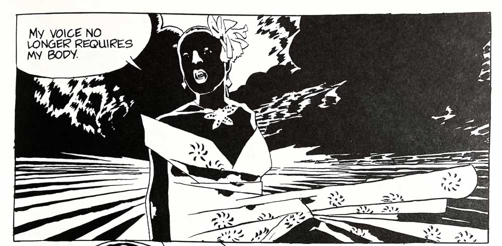
Often, a comic will start with a medium shot, where a character is in the middle of an action. Billie Holiday, a wonderful graphic novel by José Muñoz and Carlos Sampayo begins like this. We see Billie Holiday, the wind blowing her floral dress to one side, what looks like a storm behind her. She is addressing us directly, like an aside in a stage play. There is no time or place referenced, instead, it’s as though she is addressing us from beyond the grave, telling us her story. It sets the mood of the story, and the stage for the tragic events of her life. Imagine a car chase where we see into the back seat where a character is being bounced around by the jerking of the car.
Comics, An Interactive Medium
Comic books allow a lot of room for individual interpretation. They give us words and pictures, but they invite us to engage, to imagine, to bring our voice to a story. Unlike a movie, where we are watching and listening to a story, being given as complete a narrative experience as possible, in comics though, we are invited to a private party. They are an interactive experience, an intimate one where we decide what characters sound like, what the air feels like, how things feel. One of the most beautiful things about comics is that much of the action happens in our heads and not on the pages in front of us.
Other Methods in Sequential Art and Comics
In looking through the stack of comic books and graphic novels on my desk I see a variety of approaches to page one, panel one. Black Orchid book three, Written by Neil Gaiman, and Illustrated by Dave McKean opens with a white panel with a small amount of pink watercolor on the center. It is a piece of something that we cannot yet see.
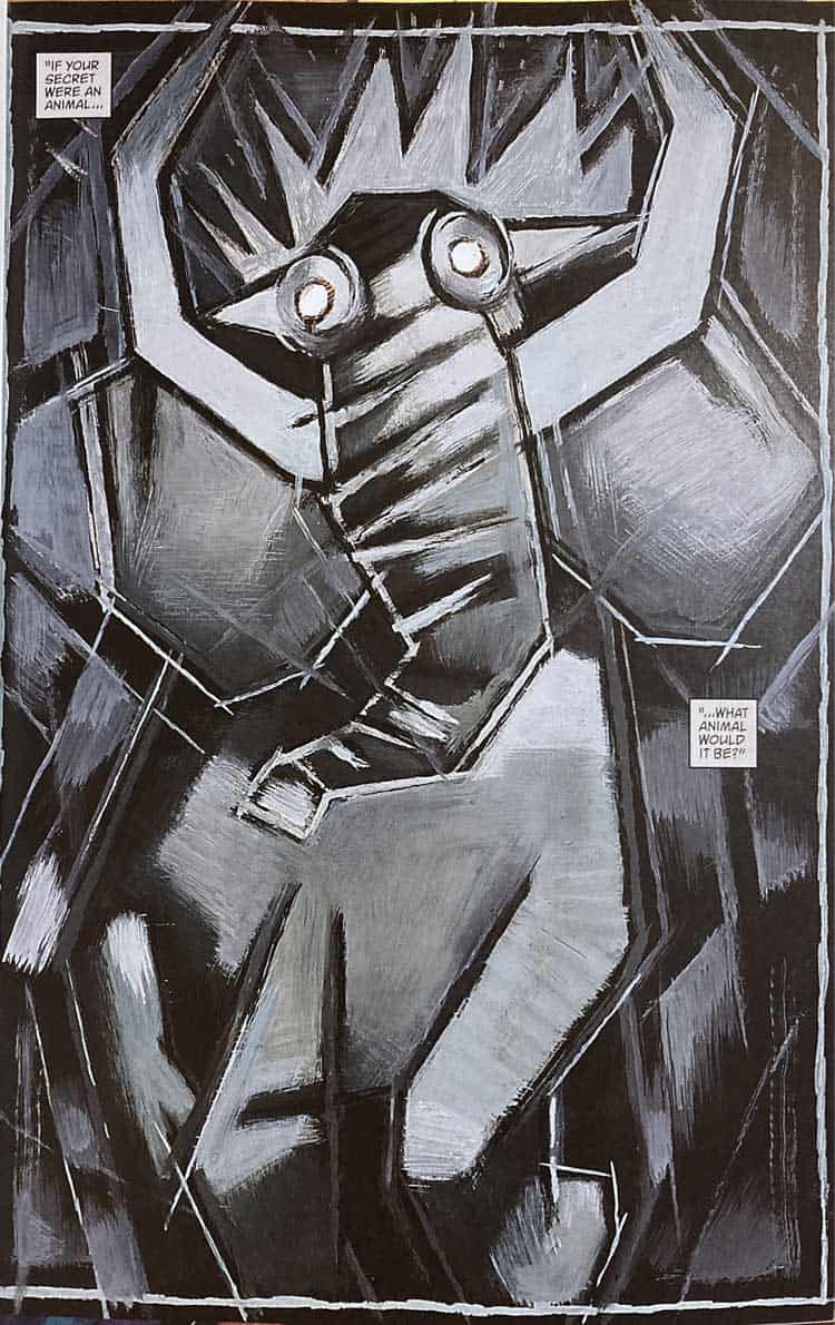
In the following panels the pink grows and is joined by dark greens. We have to turn the page to find out what these nondescript marks mean. House Of Secrets. Facade part 1 written by Steven T. Seagle and Illustrated by Teddy Kristiansen, greets us with an abstracted painting of a bull-like creature and a caption asks us, “If your secret were an animal, what animal would it be?” It is the picture of a character’s imagined monster, or possibly a symbolic representation of the story as a whole. By using images outside of strict representation the creators are setting an emotional tone for the story.
Designing Sequential Art
Now that you’ve decided on the what of panel one of your comic, let’s focus on the how. I call this “walking around the scene”. For example, say you have decided to open your comic with a close up of a face. My approach to designing the first panel would be to put pencil to paper and create thumbnails. These are small, quickly made drawings with very few marks to explore where the face is, how much we can see, what angle I’m going to use, how it’s going to be lit, and the overall value structure of the image, are we looking up, down, or straight at the thing being shown.
One of the main considerations is emotion, both the emotion of the character and of the narrative as a whole. Then I as myself a series of questions, what is the character feeling? What is the situation? Is the character in a dominant position, or are they being dominated?
Unlimited Budget
In making art for sequential stories, one thing I remind myself is that what’s on the page isn’t reality. I have gotten myself trapped by thinking of comics as movies on a page and found this to be limiting. Comics can show us both internal and external views. They can tell us one thing and show another. Not all the panels need to look the same, use the same techniques, type of borders, color scheme, or media. Comic books that utilize a variety of approaches and let the needs of the story determine the visual approach are incredibly powerful.
When making a comic you have an unlimited special effects budget. You can take us to the far ends of the galaxy, or through a character’s dreams. You can use any color or visual media that will print, and you have the power to show us not only what the characters are doing, but what they are thinking and feeling.
Time To Draw
I hope that this has been of some help to you. Go draw your first panel.
