Concept art is the latest frontier in the evolution of visual arts. With the rapid advancement of digital technology, it’s never been easier to create imaginary worlds that feel stunningly real. Visual effects in film and games have become extraordinarily grand, and are constantly pushing the boundaries of both hyper-realism and unique stylization.
Art has an interesting role in these projects. While critics and fans often put art on a lower pedestal than story or gameplay, the impact of the artwork can make or break a project. The game Hades is hugely successful, largely in part to its unique character design and refreshing comic-style character drawings. On the other hand, a poor re-design of a beloved character can spark outrage in fans.
A lot of work goes into making these characters a reality, and it all starts with concept art. 3D modeling, animation, and VFX are slow and expensive, so to efficiently develop a project character designers must lay the groundwork for everyone else: nailing the visual goals of a character, while also creating a functional design that can be produced by modelers or costume designers. In a way, character design is more akin to architecture than it is to painting, you must design something that’s visually pleasing and also practical to build.
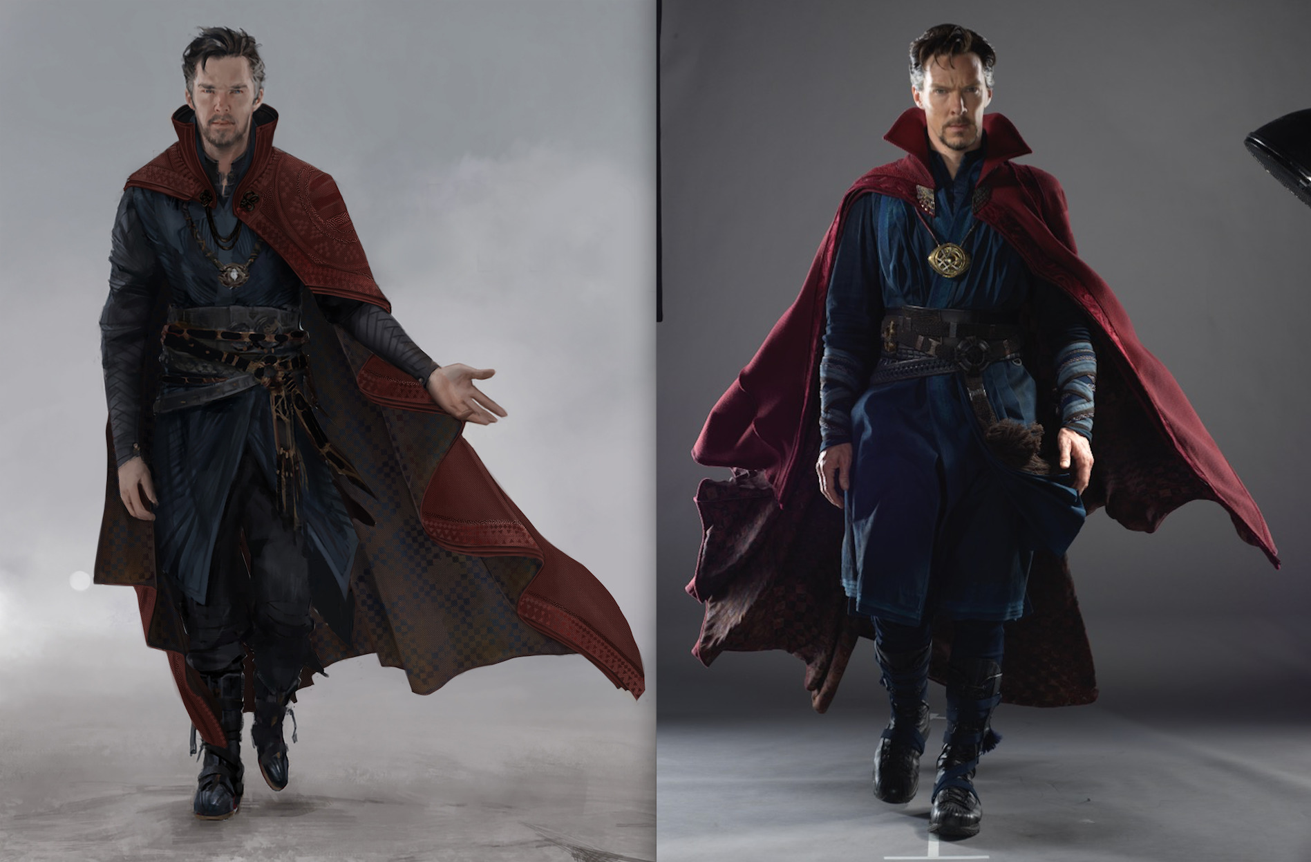
Dr. Strange concept by Karla Ortiz, © Marvel Studios
Character Design
Concept art is a wildly broad field; spanning industries like games, films, and cars, while also covering subject matter like characters, creatures, environments, vehicles, and props. No matter what you enjoy drawing, there’s space for you to express your passion. Since concept art is too broad a subject to cover in its entirety, let’s focus specifically on character design. Nearly every artist I know started their journey by creating their own characters and stories, and many artists aim to turn that passion into a career.
But before we can design great characters, we have to understand what makes a good character design. We are faced with a daunting task: Design something unique and original that also feels familiar and accessible to the audience. It’s an incredible challenge, but artists love a good challenge, so let’s dig in!
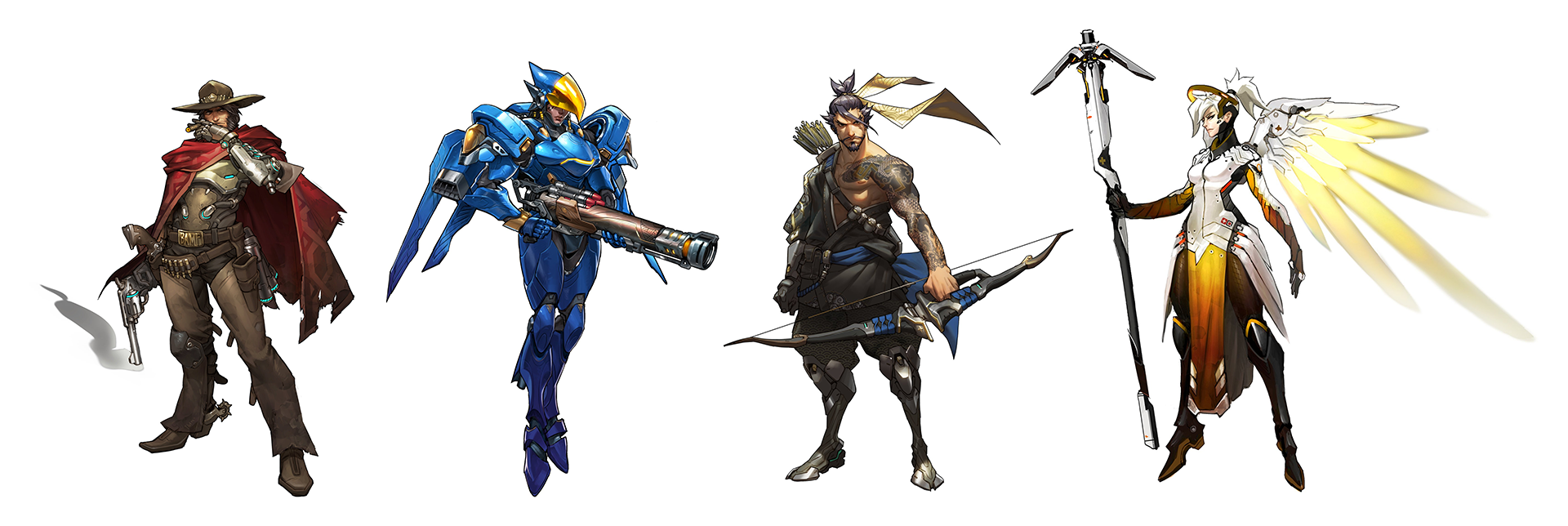
Overwatch characters by Arnold Tsang, © Blizzard Entertainment
Silhouette
There are two major components to good character design: the idea itself, and the visual communication of that idea. When we see a well-designed villain we don’t need anyone to explain to us that they are the villain, the design handles that job, staying true to the ultimate rule of narrative, “Show, don’t tell.”
Artists are overflowing with ideas, and when we first delve into character design we often express those ideas with ultra-specific details and lengthy text explanations as to who our character is and why they look the way they do: “Roderick has one silver eye from his body being infused with magic, and he wears a silver raven pendant as part of his academic order.”
These ideas aren’t bad, but relying on tiny details to make our characters unique is ineffective. While watching a film or playing a game, opportunities to show these details are rare, so overloading our designs with them in an attempt to make them unique will actually make them more forgettable.
Instead, it is important to focus primarily on the bigger picture, which in character design means silhouette. For example, if we take iconic characters and reduce them to a pure black silhouette they are still recognizable. Three circles are enough to communicate Mickey Mouse. Batman has gone through countless redesigns, but they all share the iconic cowl with pointed ears on top. Cloud from Final Fantasy is immediately recognizable by his hair and buster sword.
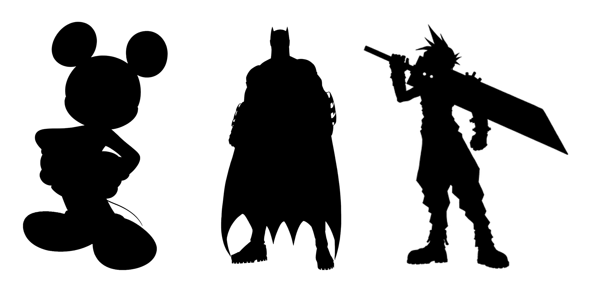
Guess Who?
These characters all have one thing in common: their design is immediately recognizable even if you strip away all the detail. It is not the complexity of their design, the colors of their hair and eyes, or their intricate backstories that make them so visually iconic. It is their silhouette.
This is not to say that detail is bad. Some designs call for high amounts of detail, while others are best left simple. The important thing to remember is that these details must be organized and contained within a recognizable silhouette for the character to be unique and memorable.

Team Fortress 2 characters by Moby Francke, © Valve Software
Shape Design
Most aspiring character designers require an important shift in thinking before they can effectively express their ideas: characters are just a collection of shapes. A silhouette is just a shape, the biggest and most important one. Within that are secondary shapes that can define clothing, weapons, hairstyles, and more. Within that are the smallest tertiary shapes, which we call details.
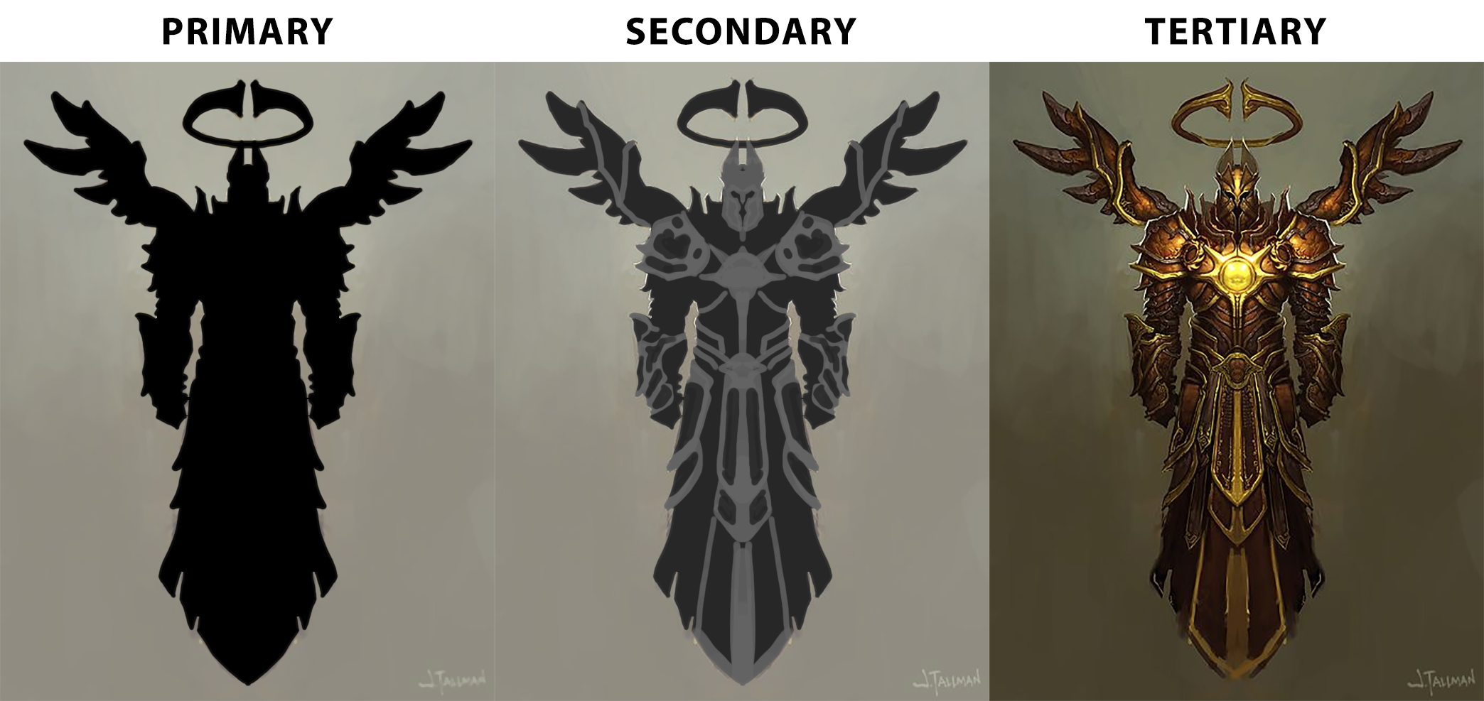
Imperius concept by Josh Tallman, © Blizzard Entertainment
The shapes we use have a significant impact on our designs, and play a big part in communicating the character’s personality and function to our audience. Our brain is a fantastic shape recognition engine that is crucial to our survival as a species. Information like “spiky thing dangerous” and “round thing safe” are cemented deep in our lizard brain and it’s important as a character designer to tap into these primal gut reactions.
This is an over-simplification of course, as we don’t want to simply cover every villain in spikes to make them appear dangerous, but having this idea in the forefront of our mind while drawing is crucial to creating compelling designs. It shifts our thinking away from, “What jewelry does this character wear?” to, “What do I feel when I look at this character?”
Distilling complicated ideas into simple, recognizable shapes is essential to creating memorable designs:
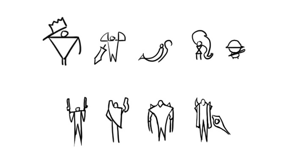
League of Legends characters by Sunny Pandita, © Riot Games
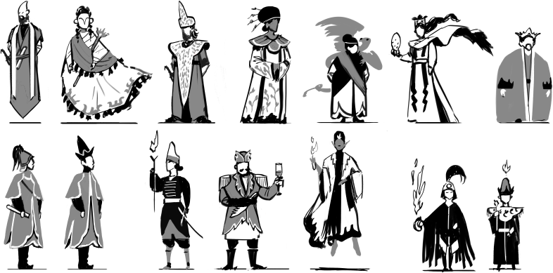
Hegemony Ministers by Lake Hurwitz
The best way to tap into this powerful tool is research and reference, humans have been designing things since the first stone tool was beaten into shape. We design for both function and aesthetic, and tapping into these universally understood visual languages is crucial. Fortunately for us, all this design is documented in countless books, websites, and images. Insatiable curiosity and diligent research is the key to finding that one unique spark of inspiration that can grow into an incredible character.
For example, we can draw a sci-fi engineer that looks raw and rugged by borrowing shapes from machinery like gears, spark plugs, and wires. This doesn’t mean literally covering our character in gears, but rather an abstraction and re-interpretation of the shape. A gear is a circle with radiating rectangles on the outside: if we give our character rounded shoulder plates with cube-like protrusions, it will feel gear-like and contribute to our goal of “rugged sci-fi engineer.” Clearly defining 2 or 3 shape languages that communicate our idea and using them consistently across our character is the ultimate secret of good design.
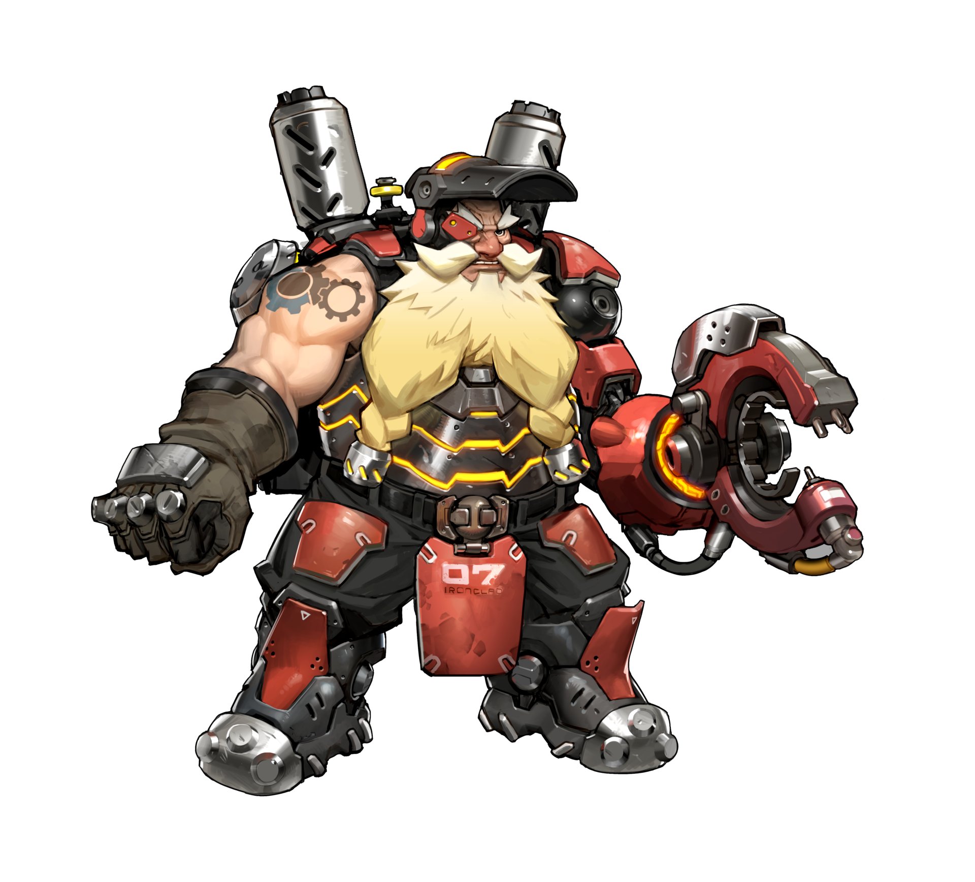
Torbjörn by Arnold Tsang, © Blizzard Entertainment
Process
Knowing this information is great, but we still need a practical way to apply it. Aspiring artists are often misled by concept art (and illustration labeled as concept art) that only shows the last step of the process: the finished drawing. Hidden within that finished drawing are many iterations and variations that the concept artist had to draw to find the final design. These early concepts for Thor are just 3 of 10 from the final spread, and there were likely dozens, if not hundreds, of rougher options that preceded them.
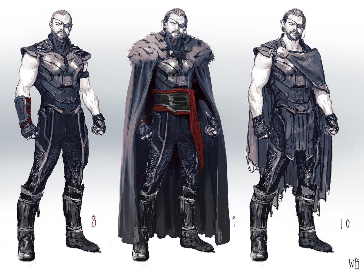
Thor concept exploration by Wes Burt, © Marvel Studios
Character design is like panning for gold, it’s slow and meticulous, and almost everything you draw will be thrown away. But hidden within the mud are a few small nuggets of gold that can be extracted and refined into something beautiful.
This is a process of iteration, where we start big and work our way down. We know how important our silhouette is to the success of our character, so we can’t just do one sketch and assume it’s the best solution. We must explore many different presentations and develop our idea relentlessly to find the solution that best expresses our character’s ideas.
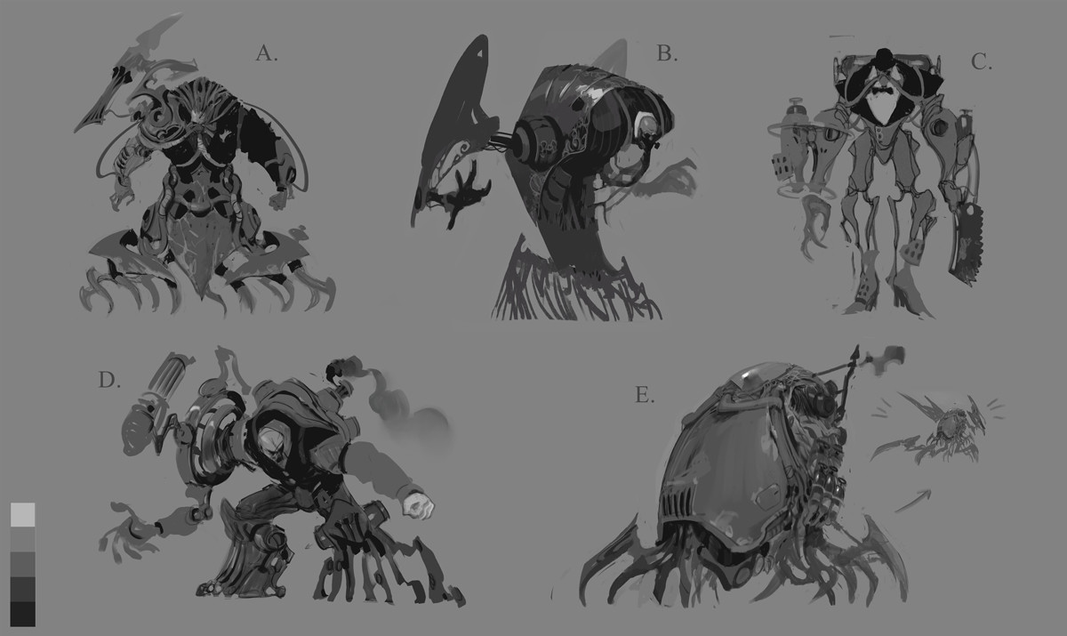
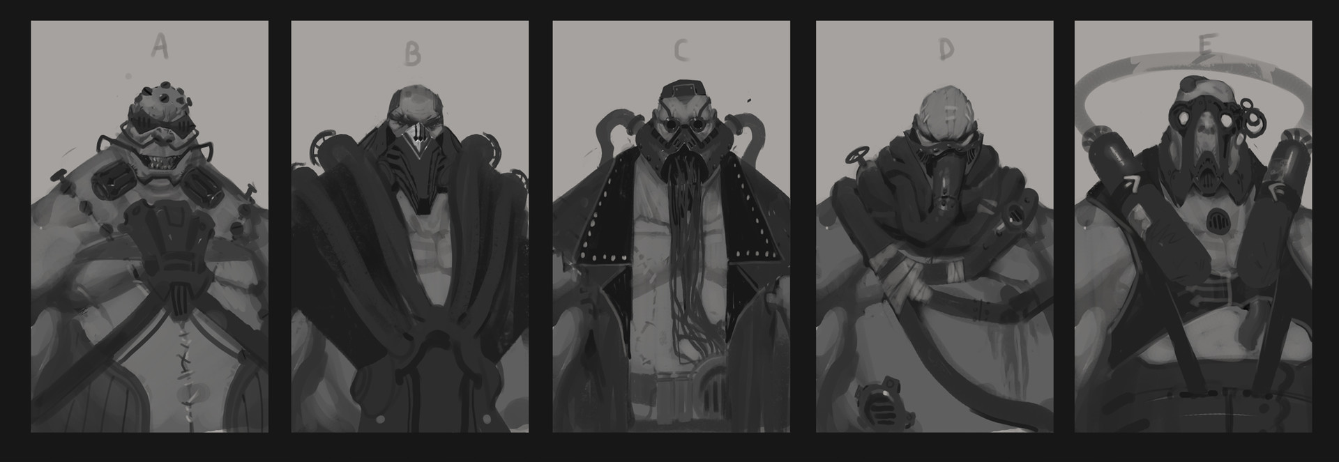
Urgot Redesign by Victor Maury, © Riot Games
After we’ve chosen a silhouette, our primary shape, we must repeat these steps with our secondary interior shapes. Think again of Batman: there are many, many versions of this character that are all recognizable as Batman. The silhouette remains largely the same, but the shapes of the armor plating, the edge of the cape, and even the iconic symbol on his chest change somewhat from comic to comic and film to film. Character designers must explore these variations, again never assuming that our first sketch is the best, and draw multiple options before moving on.
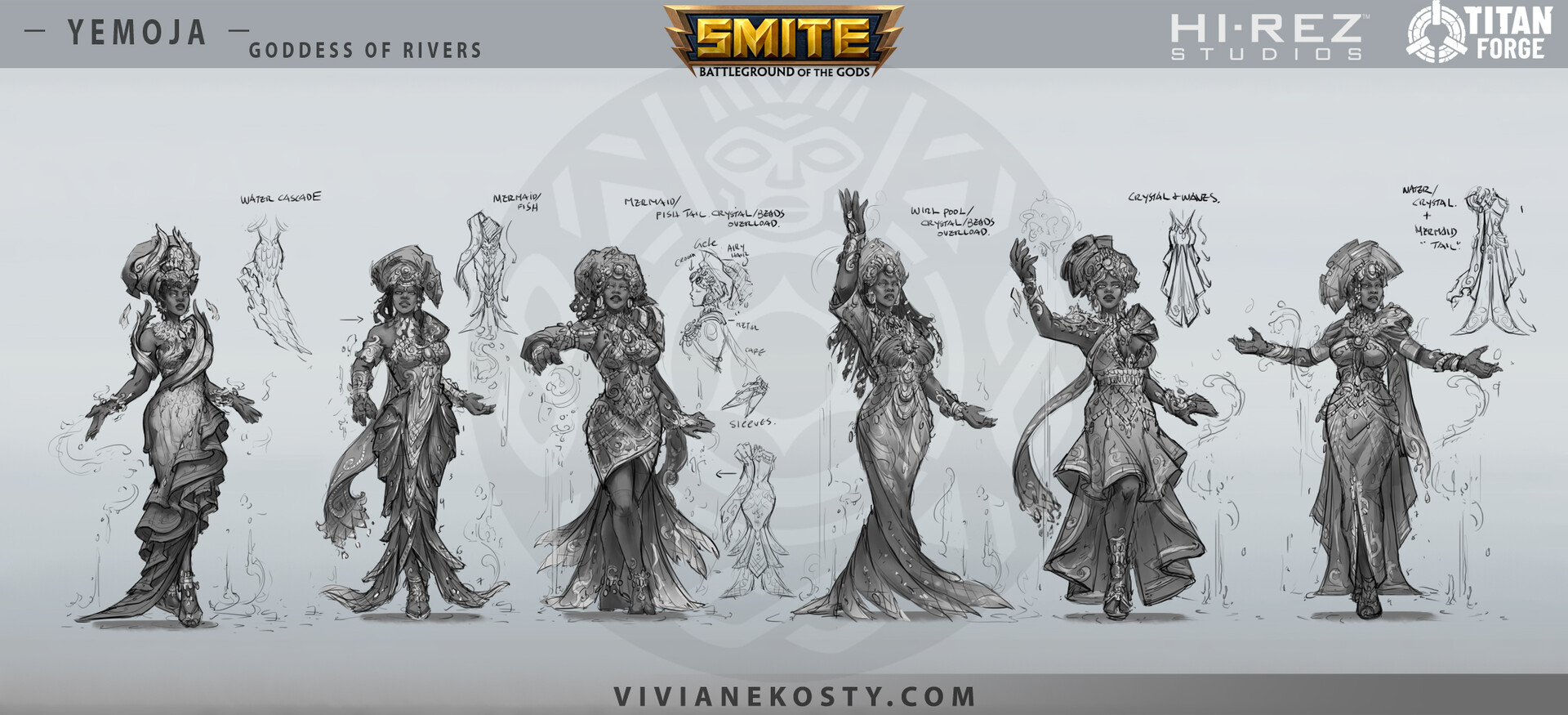
Yemoja iterations by Viviane Kosty, © Hi-Rez Studios
After this marathon of exploration and editing, we are rewarded with the opportunity to create lots of fun details, colors and materials. Always remember however that these small pieces and parts only matter if a character has a strong silhouette and iconic secondary shapes. Returning to our architecture metaphor, you can’t hang paintings and decorations before the foundation is stable and the walls are firmly constructed.
This is the primary work of character design, and it’s key that you enjoy this kind of exploration and iteration to be happy and successful in this field. It’s also the first thing art directors look at when reviewing a character designer’s portfolio. An art director doesn’t care about the lighting and texture on your final character, they care about the development and exploration to see that you are flexible and willing to explore all the options with due diligence until finding the best possible design.
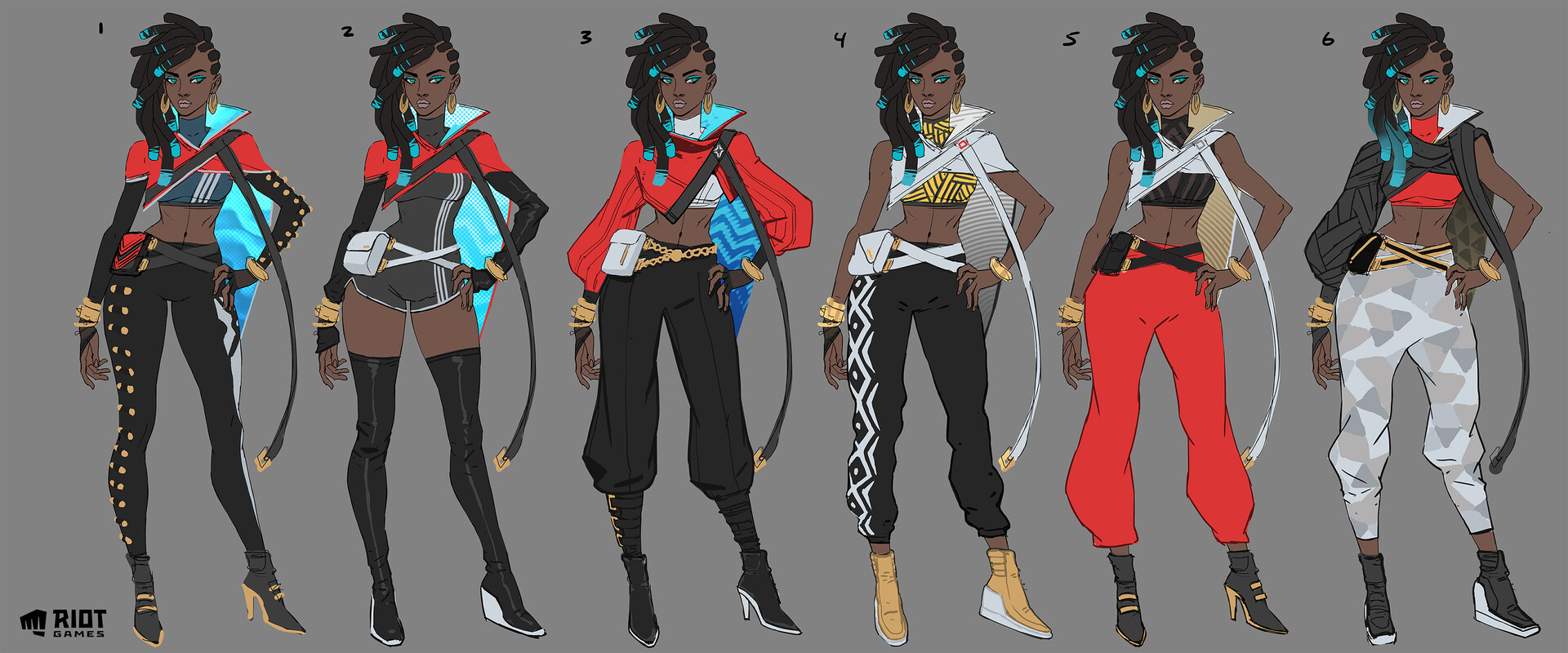
True Damage Senna by Jason Chan, © Riot Games
Fundamentals
Lastly, there is the technical side of concept art. Everyone has good ideas, but few learn the skills to execute them. An architect who designs buildings that defy the laws of physics may create some very beautiful and engaging drawings, but will not get far in the field of architecture if their design can’t actually be built. Similarly, a character designer must create designs that are both beautiful and functional; there are time, technical, and budgetary constraints that must be taken into account when designing a character.
This largely comes down to good drawing fundamentals. You must have a solid understanding of figure drawing, perspective, and form construction in order to create designs that can be translated into 3D space. These fundamentals are separate from design, but without them you can’t prove that your ideas are good and your work will be unusable in a realistic production pipeline.
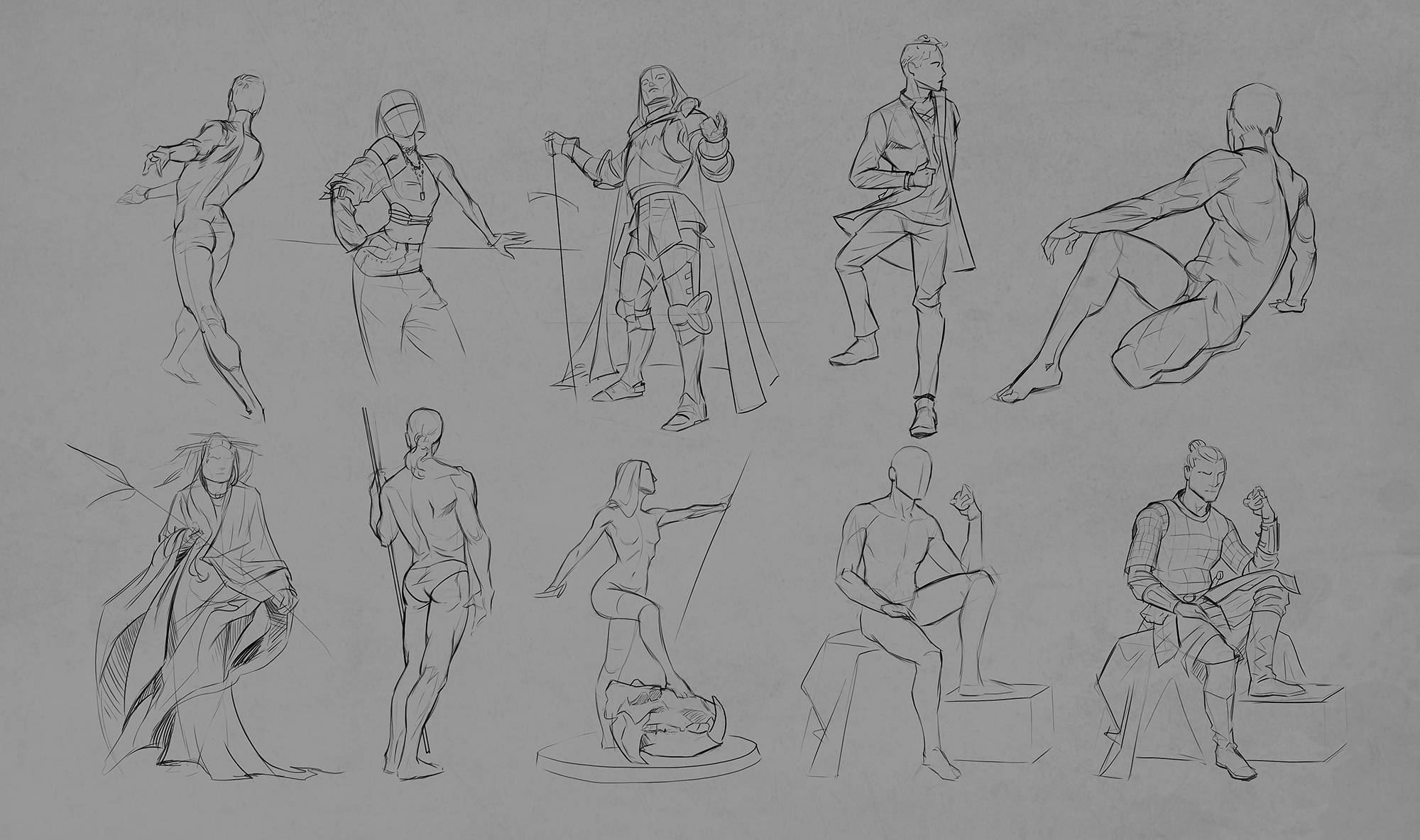
Figure Studies by Jon Neimeister
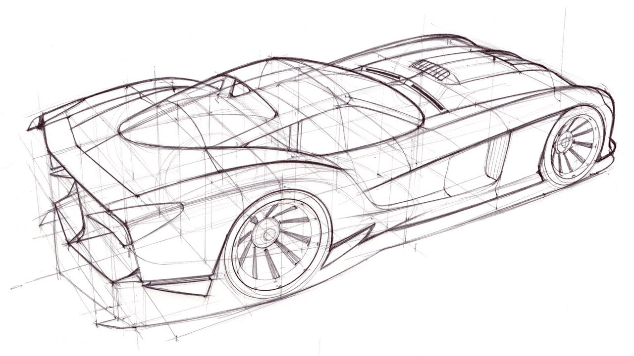
Perspective Construction by Scott Robertson
It’s clear at this point that character design is quite a challenge, and the information here may be somewhat daunting, so it’s important to hold on to the spark of inspiration that made us want to draw in the first place. That childlike wonder of being deeply impacted by someone else’s creation and wanting to do the same for others is the heart of good character design.
There are many challenges to overcome on this journey, but there’s no better feeling than putting forth your best effort and seeing your audience go, “Wow, that’s awesome!” Not for fame and Twitter likes, but for the joy of the creative process, the reward of inspiring happiness and excitement in others, and the satisfaction of creating a memorable character that will live on for years to come.

Deak Starkiller vs. Darth Vader by Ralph McQuarrie, © Lucasfilm
Return to Blog
Principles of Character Design
Jon Neimeister offers an in-depth analysis of great character design
Jon Neimeister
Concept art is the latest frontier in the evolution of visual arts. With the rapid advancement of digital technology, it’s never been easier to create imaginary worlds that feel stunningly real. Visual effects in film and games have become extraordinarily grand, and are constantly pushing the boundaries of both hyper-realism and unique stylization.
Art has an interesting role in these projects. While critics and fans often put art on a lower pedestal than story or gameplay, the impact of the artwork can make or break a project. The game Hades is hugely successful, largely in part to its unique character design and refreshing comic-style character drawings. On the other hand, a poor re-design of a beloved character can spark outrage in fans.
A lot of work goes into making these characters a reality, and it all starts with concept art. 3D modeling, animation, and VFX are slow and expensive, so to efficiently develop a project character designers must lay the groundwork for everyone else: nailing the visual goals of a character, while also creating a functional design that can be produced by modelers or costume designers. In a way, character design is more akin to architecture than it is to painting, you must design something that’s visually pleasing and also practical to build.
Dr. Strange concept by Karla Ortiz, © Marvel Studios
Character Design
Concept art is a wildly broad field; spanning industries like games, films, and cars, while also covering subject matter like characters, creatures, environments, vehicles, and props. No matter what you enjoy drawing, there’s space for you to express your passion. Since concept art is too broad a subject to cover in its entirety, let’s focus specifically on character design. Nearly every artist I know started their journey by creating their own characters and stories, and many artists aim to turn that passion into a career.
But before we can design great characters, we have to understand what makes a good character design. We are faced with a daunting task: Design something unique and original that also feels familiar and accessible to the audience. It’s an incredible challenge, but artists love a good challenge, so let’s dig in!
Overwatch characters by Arnold Tsang, © Blizzard Entertainment
Silhouette
There are two major components to good character design: the idea itself, and the visual communication of that idea. When we see a well-designed villain we don’t need anyone to explain to us that they are the villain, the design handles that job, staying true to the ultimate rule of narrative, “Show, don’t tell.”
Artists are overflowing with ideas, and when we first delve into character design we often express those ideas with ultra-specific details and lengthy text explanations as to who our character is and why they look the way they do: “Roderick has one silver eye from his body being infused with magic, and he wears a silver raven pendant as part of his academic order.”
These ideas aren’t bad, but relying on tiny details to make our characters unique is ineffective. While watching a film or playing a game, opportunities to show these details are rare, so overloading our designs with them in an attempt to make them unique will actually make them more forgettable.
Instead, it is important to focus primarily on the bigger picture, which in character design means silhouette. For example, if we take iconic characters and reduce them to a pure black silhouette they are still recognizable. Three circles are enough to communicate Mickey Mouse. Batman has gone through countless redesigns, but they all share the iconic cowl with pointed ears on top. Cloud from Final Fantasy is immediately recognizable by his hair and buster sword.
Guess Who?
These characters all have one thing in common: their design is immediately recognizable even if you strip away all the detail. It is not the complexity of their design, the colors of their hair and eyes, or their intricate backstories that make them so visually iconic. It is their silhouette.
This is not to say that detail is bad. Some designs call for high amounts of detail, while others are best left simple. The important thing to remember is that these details must be organized and contained within a recognizable silhouette for the character to be unique and memorable.
Team Fortress 2 characters by Moby Francke, © Valve Software
Shape Design
Most aspiring character designers require an important shift in thinking before they can effectively express their ideas: characters are just a collection of shapes. A silhouette is just a shape, the biggest and most important one. Within that are secondary shapes that can define clothing, weapons, hairstyles, and more. Within that are the smallest tertiary shapes, which we call details.
Imperius concept by Josh Tallman, © Blizzard Entertainment
The shapes we use have a significant impact on our designs, and play a big part in communicating the character’s personality and function to our audience. Our brain is a fantastic shape recognition engine that is crucial to our survival as a species. Information like “spiky thing dangerous” and “round thing safe” are cemented deep in our lizard brain and it’s important as a character designer to tap into these primal gut reactions.
This is an over-simplification of course, as we don’t want to simply cover every villain in spikes to make them appear dangerous, but having this idea in the forefront of our mind while drawing is crucial to creating compelling designs. It shifts our thinking away from, “What jewelry does this character wear?” to, “What do I feel when I look at this character?”
Distilling complicated ideas into simple, recognizable shapes is essential to creating memorable designs:
League of Legends characters by Sunny Pandita, © Riot Games
Hegemony Ministers by Lake Hurwitz
The best way to tap into this powerful tool is research and reference, humans have been designing things since the first stone tool was beaten into shape. We design for both function and aesthetic, and tapping into these universally understood visual languages is crucial. Fortunately for us, all this design is documented in countless books, websites, and images. Insatiable curiosity and diligent research is the key to finding that one unique spark of inspiration that can grow into an incredible character.
For example, we can draw a sci-fi engineer that looks raw and rugged by borrowing shapes from machinery like gears, spark plugs, and wires. This doesn’t mean literally covering our character in gears, but rather an abstraction and re-interpretation of the shape. A gear is a circle with radiating rectangles on the outside: if we give our character rounded shoulder plates with cube-like protrusions, it will feel gear-like and contribute to our goal of “rugged sci-fi engineer.” Clearly defining 2 or 3 shape languages that communicate our idea and using them consistently across our character is the ultimate secret of good design.
Torbjörn by Arnold Tsang, © Blizzard Entertainment
Process
Knowing this information is great, but we still need a practical way to apply it. Aspiring artists are often misled by concept art (and illustration labeled as concept art) that only shows the last step of the process: the finished drawing. Hidden within that finished drawing are many iterations and variations that the concept artist had to draw to find the final design. These early concepts for Thor are just 3 of 10 from the final spread, and there were likely dozens, if not hundreds, of rougher options that preceded them.
Thor concept exploration by Wes Burt, © Marvel Studios
Character design is like panning for gold, it’s slow and meticulous, and almost everything you draw will be thrown away. But hidden within the mud are a few small nuggets of gold that can be extracted and refined into something beautiful.
This is a process of iteration, where we start big and work our way down. We know how important our silhouette is to the success of our character, so we can’t just do one sketch and assume it’s the best solution. We must explore many different presentations and develop our idea relentlessly to find the solution that best expresses our character’s ideas.
Urgot Redesign by Victor Maury, © Riot Games
After we’ve chosen a silhouette, our primary shape, we must repeat these steps with our secondary interior shapes. Think again of Batman: there are many, many versions of this character that are all recognizable as Batman. The silhouette remains largely the same, but the shapes of the armor plating, the edge of the cape, and even the iconic symbol on his chest change somewhat from comic to comic and film to film. Character designers must explore these variations, again never assuming that our first sketch is the best, and draw multiple options before moving on.
Yemoja iterations by Viviane Kosty, © Hi-Rez Studios
After this marathon of exploration and editing, we are rewarded with the opportunity to create lots of fun details, colors and materials. Always remember however that these small pieces and parts only matter if a character has a strong silhouette and iconic secondary shapes. Returning to our architecture metaphor, you can’t hang paintings and decorations before the foundation is stable and the walls are firmly constructed.
This is the primary work of character design, and it’s key that you enjoy this kind of exploration and iteration to be happy and successful in this field. It’s also the first thing art directors look at when reviewing a character designer’s portfolio. An art director doesn’t care about the lighting and texture on your final character, they care about the development and exploration to see that you are flexible and willing to explore all the options with due diligence until finding the best possible design.
True Damage Senna by Jason Chan, © Riot Games
Fundamentals
Lastly, there is the technical side of concept art. Everyone has good ideas, but few learn the skills to execute them. An architect who designs buildings that defy the laws of physics may create some very beautiful and engaging drawings, but will not get far in the field of architecture if their design can’t actually be built. Similarly, a character designer must create designs that are both beautiful and functional; there are time, technical, and budgetary constraints that must be taken into account when designing a character.
This largely comes down to good drawing fundamentals. You must have a solid understanding of figure drawing, perspective, and form construction in order to create designs that can be translated into 3D space. These fundamentals are separate from design, but without them you can’t prove that your ideas are good and your work will be unusable in a realistic production pipeline.
Figure Studies by Jon Neimeister
Perspective Construction by Scott Robertson
It’s clear at this point that character design is quite a challenge, and the information here may be somewhat daunting, so it’s important to hold on to the spark of inspiration that made us want to draw in the first place. That childlike wonder of being deeply impacted by someone else’s creation and wanting to do the same for others is the heart of good character design.
There are many challenges to overcome on this journey, but there’s no better feeling than putting forth your best effort and seeing your audience go, “Wow, that’s awesome!” Not for fame and Twitter likes, but for the joy of the creative process, the reward of inspiring happiness and excitement in others, and the satisfaction of creating a memorable character that will live on for years to come.
Deak Starkiller vs. Darth Vader by Ralph McQuarrie, © Lucasfilm
Jon Neimeister
Concept Artist & Character Designer
Share this entry
Classes Now Enrolling
Alexandria Neonakis: Illustrator, Concept Artist, Character Designer
Tyler Jacobson, Fantasy Artist
Lindsey Carr: Artist, Programmer, and Illustrator
Propoganda Art As Pest Control
J. C. Leyendecker: An Illustrator’s Private Life and Public Influence